
Explains how crypto dashboards aggregate on‑chain and off‑chain data for traders, protocols, and analysts, covering DeFi analytics (Dune, DefiLlama), portfolio and trading UIs, AI‑driven automation, risk, design, and future trends.
+3 sources across the wider coverage universe
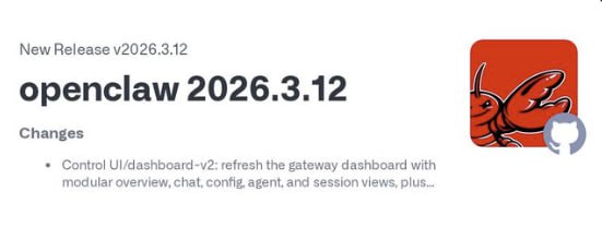 OpenClaw releases version 2026.3.12, debuting a redesigned Dashboard v2, faster local AI modes, and 100+ security improvements for its multi‑platform proactive agent framework.2026-03
 El Salvador launches online dashboard to monitor its $360MM worth of Bitcoin holdings in realtime2024-05
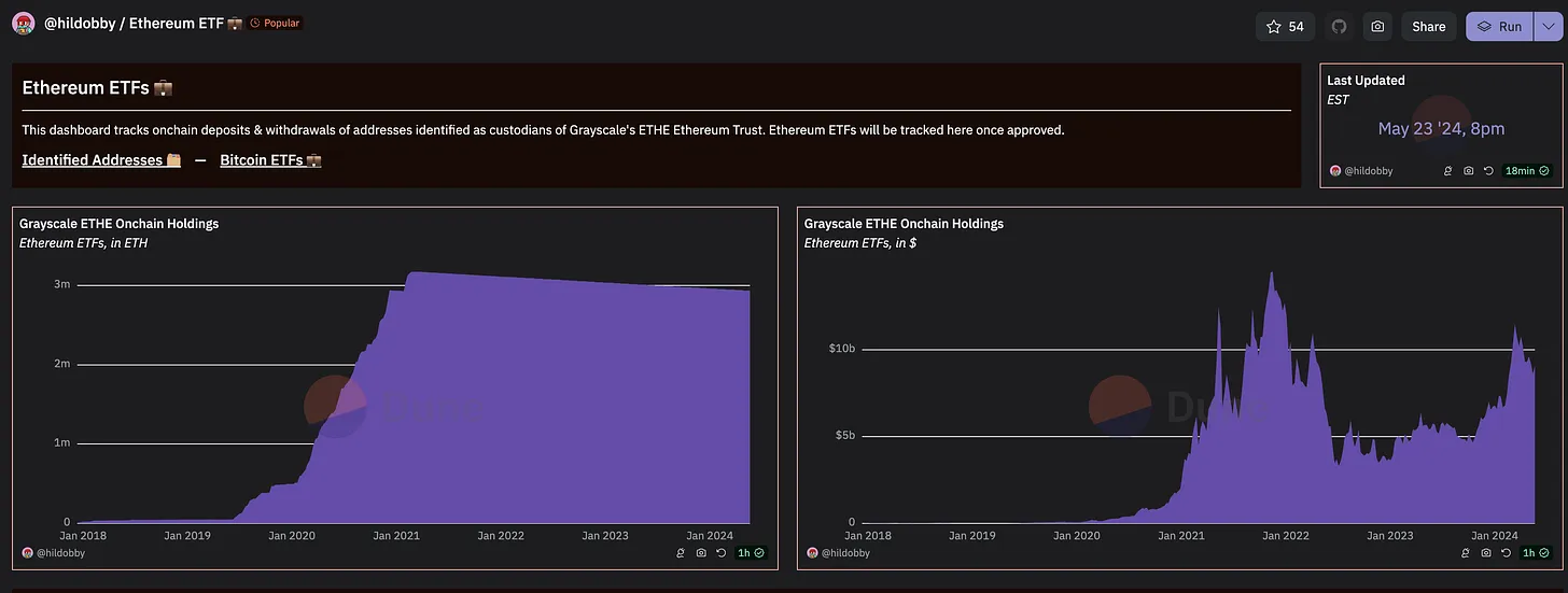 Track ETH ETF inflows on Hildobby's Dune dashboard2024-05
- Atomic Wallet hack visualized, a Dune dashboard created by Taylor Monahan. 2023-06
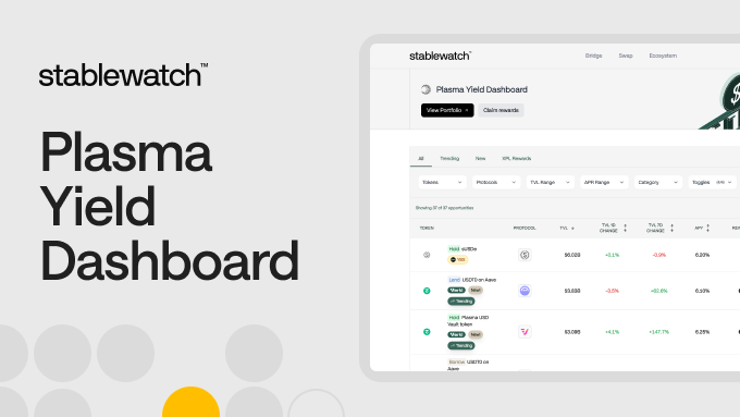 Stablewatch created a dashboard dedicated to Plasma2025-10
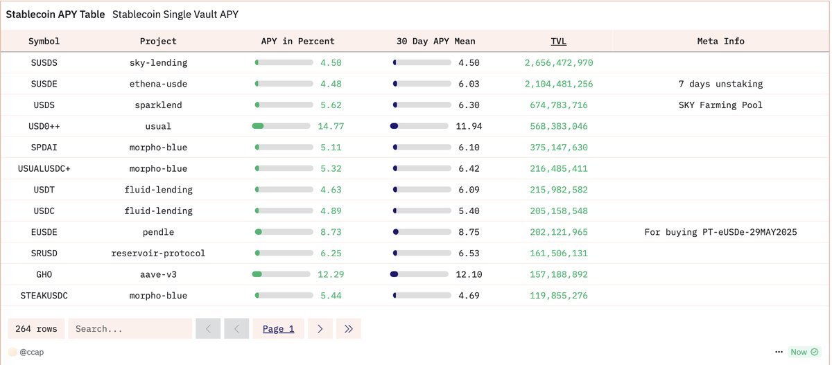 Dune dashboard for tracking stablecoin yields2025-04
Dashboard
In crypto and DeFi, a dashboard is an interactive interface that aggregates data from wallets, exchanges, blockchains, and protocols into a single view so users can monitor markets, positions, and risks in real time. Unlike a static report, a dashboard is designed for ongoing decision-making, updating as new on‑chain and off‑chain information arrives and letting users explore that information through filters, charts, and drill‑downs.
What Is A Dashboard In Crypto?
The term “dashboard” comes from business intelligence, where it describes a visual layer on top of complex databases that makes key performance indicators, or KPIs, easy to interpret at a glance. In the crypto context, dashboards serve the same function but are wired into on‑chain data, exchange order books, lending markets, bridges, stablecoins, and governance systems, often across dozens of networks. A data analytics dashboard consolidates information scattered across tables and documents into a unified view and presents it through interactive visuals, such as charts, graphs, and tables. This kind of interface is particularly important in crypto because the underlying data is public but fragmented, often living in raw blockchain logs that are difficult to interpret without specialized tooling.
Analytics experts usually distinguish between strategic, operational, and tactical dashboards, and this taxonomy maps neatly onto crypto use cases. Strategic dashboards summarize high‑level metrics over longer time horizons, such as total value locked (TVL), market capitalization, or protocol revenues for major DeFi sectors. Operational dashboards monitor systems in near real time, such as bridge flows, order books, liquidation queues, or arbitrage opportunities that require minute‑by‑minute awareness. Tactical dashboards support focused analysis, for example exploring how changes in Curve’s pool incentives affect volume, or how Ethena’s hedging strategy is evolving, where a user wants to slice data by asset, pool, or time period to answer a specific question.
In practical terms, a crypto dashboard sits on top of one or more data pipelines and presents metrics using charts, tables, and cards arranged in a layout optimized for a particular audience. Platforms such as Dune and DefiLlama provide generic frameworks where creators can query on‑chain data, define visualizations, and assemble them into multi‑page dashboards. Others, like portfolio trackers or trading terminals, ship pre‑defined dashboards that focus on a narrow task such as monitoring a wallet’s performance or managing orders on a single exchange. What unifies these experiences is not the feature set but the idea of a single pane of glass where the most important signals rise above the noise of the broader market.
The table below summarizes the main dashboard categories as they typically appear in crypto and DeFi.
| Dashboard type | Primary purpose | Example platforms / patterns |
|---|---|---|
| Strategic analytics | Long‑term trends and high‑level KPIs such as TVL, revenues, and sector dominance. | DefiLlama sector and stablecoin dashboards; Dune overviews for stablecoins, Ethena, Curve. |
| Operational monitoring | Real‑time system health and flows such as bridge volume, fees, or arbitrage spreads. | BridgeWTF interop dashboard; AI‑powered arbitrage and orderflow dashboards on pro trading tools. |
| Tactical analysis | Deep dives into specific protocols, pools, or strategies to support decisions or research. | Block Analitica’s Sky and Sphere dashboards; Dune dashboards for protocol tokenomics or stablecoin yields. |
This categorization is flexible rather than rigid; a single dashboard can combine strategic tiles at the top with operational charts and tactical drill‑downs below, which is a common pattern in well‑designed crypto analytics interfaces. The key is that the design reflects the decisions the user needs to make, whether that is repositioning liquidity, rebalancing a Bitcoin treasury, or assessing the concentration risk in a new token launch.

OpenClaw releases version 2026.3.12, debuting a redesigned Dashboard v2, faster local AI modes, and 100+ security improvements for its multi‑platform proactive agent framework.
@leviathan_news OpenClaw could really benefit from a memory system. Check out this article to see how to add local open source long term memory: https://t.co/jn05T2RzS8
Readers click dashboard stories not for performance monitoring but for forensic accountability — the top-clicked items all expose something previously opaque: a government's Bitcoin stack, a hack's money trail, a custodian's reserve omission.↗
Core Types Of Crypto Dashboards
Market and On‑Chain Analytics Dashboards
Market and on‑chain analytics dashboards sit at the foundation of the crypto data ecosystem, because they turn raw blockchain transactions and protocol state into interpretable metrics. Platforms such as Dune ingest on‑chain data from more than a hundred networks, normalize it into queryable tables, and let users write SQL queries that power reusable visualizations and dashboards. A typical analytics dashboard on Dune is built from widgets, each encapsulating a visualization or text block, arranged into a layout that can be edited, resized, and extended over time. These dashboards can be refreshed manually or on a schedule, allowing them to function as living publications that evolve with the protocols they track.
DefiLlama plays a complementary role by aggregating DeFi protocol data across thousands of projects and hundreds of chains, exposing metrics such as TVL, fees, and volumes through both public pages and more advanced paid dashboards. Its stablecoin section, for example, offers a market cap and peg‑tracking dashboard that shows circulating supply, prices, inflows, and stability metrics across the universe of stablecoins. This kind of dashboard turns what would otherwise be a patchwork of issuer‑specific disclosures and on‑chain balances into a consolidated overview that can be used by traders, risk managers, and journalists alike. Dune’s dedicated stablecoin overview similarly classifies transfers by economic intent and labels holders by venue type, offering another lens on how stablecoins move through the crypto economy.
These analytics dashboards are not limited to generic sectors; they often focus on specific protocols or themes. Ethena, a synthetic dollar protocol, has a “Master Metrics” dashboard on Dune that tracks key indicators such as supply, collateral composition, and user segmentation, and forms part of a wider suite of interconnected dashboards for deeper analysis. Curve, a long‑running automated market maker, is similarly tracked by dedicated dashboards on Dune that surface metrics like pool TVL, volume, fees, and gauge emissions. For Bitcoin, Ethereum, and other major assets, third‑party analytics sites often assemble dashboards combining on‑chain metrics such as realized value, UTXO age bands, and exchange flows with derivatives data, although many of these are proprietary and not represented in the public search results.
Cross‑chain infrastructure has given rise to a distinct class of dashboards focused on interoperability and bridge risk. BridgeWTF, for instance, provides a cross‑chain analytics dashboard that tracks real‑time bridge volumes, fees, and KPIs across bridges, aggregators, and generalized message‑passing protocols. By benchmarking bridge flows against decentralized exchange (DEX) spot trading volume, it helps users gauge how much value is moving through interop rails relative to local trading activity. As more assets, including wrapped Bitcoin and stablecoins, rely on bridges to move between ecosystems, these dashboards become essential tools for monitoring systemic risk and tuning routing decisions.
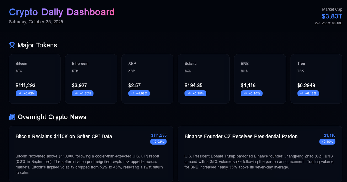
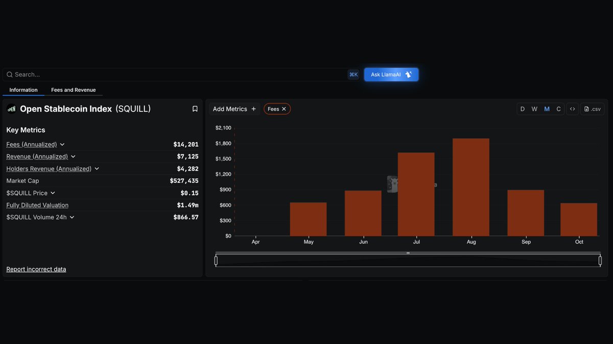
For newsrooms and researchers, market and on‑chain analytics dashboards act as both data sources and visual aids. Daily crypto news dashboards that surface overnight headlines, top‑performing tokens from sources like CoinGecko, and trending Reddit discussions are increasingly used internally to prioritize coverage and externally to give readers a snapshot of what matters. When DefiLlama began tracking the OPEN Stablecoin Index on its fees and revenue dashboards, or launched dashboards to track digital asset treasuries across Bitcoin, Ethereum, Solana, and other networks, it effectively defined new lenses for understanding the market that reporters and analysts quickly adopted. The availability and design of these dashboards, in other words, shape the narratives that emerge around Bitcoin, DeFi, and the broader crypto space.
Portfolio and Treasury Dashboards
Portfolio dashboards focus on the holdings and performance of a specific user, entity, or protocol rather than the entire market. They aim to answer questions like “What is my net exposure to Ethereum?” or “How has my DeFi farming strategy performed over the last quarter?” A crypto portfolio tracker typically connects to multiple wallets, exchanges, and blockchains to monitor all of a user’s cryptocurrency investments in one place. CoinStats, for example, allows users to sync their wallets and exchange accounts in a few clicks, pulling balances and transaction histories together into a single portfolio dashboard that spans spot holdings, DeFi positions, and NFTs. This consolidates information that would otherwise require logging into a dozen interfaces, greatly reducing operational friction for active users.
On the institutional side, treasury and investor dashboards play a similar role for companies and DAOs. Cypherpunk Technologies’ investor dashboard, launched alongside an announcement that it had increased its Zcash stake, is a typical example: it is designed to give shareholders direct access to information about the firm’s digital asset holdings, allowing them to verify disclosures and track changes in near real time. DefiLlama’s digital asset treasury dashboards extend this idea to protocols, tracking on‑chain treasuries across major assets like Bitcoin and Ethereum, as well as native governance tokens and stablecoin reserves. By correlating treasury data with market metrics and emissions schedules, these dashboards help users assess the sustainability of protocol incentives and the health of DAO balance sheets.
Wallet applications are increasingly blurring the line between storage and analytics by integrating portfolio dashboards directly into the wallet interface. Safe{Wallet}, originally known as Gnosis Safe, is a popular multisig wallet for secure on‑chain asset management that emphasizes on‑chain approvals and auditability. Its newer “Positions”‑style features, which aggregate DeFi positions across protocols into a unified view, effectively make the wallet itself a dashboard for smart contract exposures, allowing teams to review positions and approvals before signing transactions. This reflects a broader trend toward dashboards that are not just observational but actionable, embedding controls that let users rebalance or de‑risk from within the same interface where they monitor their exposure.
Points and rewards systems, common in newer DeFi protocols and NFT ecosystems, also rely on dashboards to convey entitlements and incentives. A points dashboard that shows allocations for all holders of a token like SQUID, for instance, gives users clarity about their share of an upcoming airdrop or fee distribution and encourages engagement without requiring them to manually compute scores from raw on‑chain events. Similarly, campaign dashboards that rank addresses by metrics such as tax dividends, volume, or token burns translate complex distribution logic into understandable league tables. These interfaces are especially important in seasons of intense “points meta” competition, where multiple programs compete for users’ attention and clear dashboards can be the difference between adoption and confusion.
Trading and Arbitrage Dashboards
Trading dashboards are optimized for speed and precision, emphasizing real‑time prices, order book depth, and risk metrics over long‑term charts. Many centralized exchanges and professional trading platforms provide proprietary dashboards, but a growing number of third‑party tools sit on top of exchange APIs and DeFi protocols to offer specialized analytics and automation. Coinrule’s AI‑powered trading dashboard, for example, allows users to monitor signals, positions, and risk in a single interface, then automate rule‑based entries and exits across top exchanges. Instead of switching between multiple tabs, traders can track Bitcoin, Ethereum, and altcoins from one command center and configure bots that react to indicators according to pre‑defined rules.
Orderflow‑oriented dashboards, such as those built on TradingView with custom scripts, combine indicators like VWAP, cumulative delta, relative volume, and liquidity proximity into unified panels designed to highlight institutional participation and exhaustion zones. Institutional Orderflow Pro, a TradingView script, is positioned as a next‑generation order flow analysis indicator that measures edge with confidence intervals and runs without repainting, effectively acting as a specialized dashboard for intraday traders. These tools illustrate how dashboards can encapsulate complex statistical logic while presenting it in a visually digestible form that traders can interpret quickly during fast markets.
Arbitrage dashboards extend this logic to multi‑venue strategies, where the goal is to exploit price discrepancies or funding rate differentials across exchanges and protocols. Tutorials for automated crypto arbitrage bots often emphasize the importance of connecting to exchanges such as Coinbase via API keys, configuring which cryptocurrencies to trade, and then monitoring performance through a dashboard that displays account value, allocated funds, and per‑pair allocations. In these setups, a user might allow the bot to trade USDC and other assets but explicitly prevent it from withdrawing funds by limiting API permissions, relying on the dashboard to manage allocations and track realized and unrealized profits. More advanced setups integrate AI components that analyze external trend data and automatically adjust trading strategies on a schedule, as seen in workflows that connect large language models to trading infrastructure through managed connectors and routines.
AI‑powered arbitrage dashboards, including those launched on niche platforms, push the boundary further by combining delta‑neutral strategies, institution‑grade risk controls, and real‑time monitoring targeted at professional traders. Though specific implementations vary, the pattern is consistent: a central panel surfaces spreads, funding rates, and position sizes; sub‑panels show historical performance and stress tests; and control surfaces allow traders or AI agents to adjust risk budgets. For newsrooms, these dashboards are particularly interesting because they can both reveal and obscure risk, depending on how transparently they present leverage, counterparty exposure, and assumptions about market behavior.
Protocol, Risk, and Governance Dashboards
Beyond user portfolios and trading strategies, dashboards play a crucial role in how protocols and DAOs communicate their health and risk to stakeholders. Risk and analytics dashboards for stablecoin and lending ecosystems, such as the Sky Risk & Analytics Dashboard, aim to provide a holistic view of protocol performance, including collateral composition, yield, and systemic risk indicators. Block Analitica’s Sphere Dashboard includes a dedicated leverage page where users can compare net APYs, including native token yields, view liquidation prices for all pools, and estimate potential unwinding costs. These dashboards help both individual depositors and institutional risk teams evaluate whether leveraged strategies are appropriately compensated and how quickly they might unravel under stress.
Stablecoin issuers and wrappers increasingly maintain public dashboards to prove reserves and demonstrate peg stability. DefiLlama’s stablecoin dashboard tracks market cap, circulating supply, prices, inflows, and peg deviation for a wide universe of stablecoins, offering a real‑time view of which assets are trading at a premium or discount. On Dune, a dedicated stablecoin yields dashboard aggregates returns across venues and products, making it easier to compare risk‑adjusted yields rather than chasing headline APYs in isolation. Wrapped Bitcoin issuers have also used dashboards to publish proof‑of‑reserves, linking representations on non‑Bitcoin chains back to custodied BTC and updating views as supported networks change, for example by removing representations on specific chains when they are no longer maintained. For Bitcoin holders and regulators alike, these dashboards are critical in distinguishing fully backed representations from more opaque synthetic exposures.
Governance and tokenomics dashboards translate the mechanics of voting power, lockups, and emissions into visual stories. For example, community‑built Dune dashboards have documented that nearly all of the veAERO supply for the Aerodrome protocol is max locked, and analyzed the implications for liquidity, governance capture, and token price dynamics. Ethena’s dashboards reveal how its hedging positions are distributed across venues and how funding rates affect protocol profitability. Curve’s dashboards, similarly, show how gauge weights and voting decisions redirect emissions over time, helping participants understand the power dynamics behind veCRV markets. These dashboards act as accountability mechanisms: when emissions or lockups become highly concentrated, the evidence is visible to anyone willing to read the data.
Campaign and partner dashboards extend governance concepts to broader ecosystems. Partner dashboards for chains such as Kaia or NEAR, for instance, may surface integration metrics, intent execution statistics, or infra provider performance, giving both core teams and partners a shared view of progress. Tax dividend ranking dashboards that score addresses by market cap, volume, or burn, and stablecoin‑focused dashboards such as Stablewatch’s Plasma monitor, reflect a similar desire to tie complex token designs back to concrete, observable outcomes. The challenge, and opportunity, is to design these dashboards so that they highlight real risk and value rather than simply reinforcing marketing narratives.
- 01Sovereign Bitcoin treasury transparency
El Salvador's real-time $360M BTC dashboard turned a political bet into a publicly auditable position, making government crypto exposure legible for the first time at national scale.
- 02Dune as forensic hack tool↗
The Atomic Wallet and WazirX incidents showed readers that Dune dashboards are the fastest way to visualize stolen-fund flows and hold exploiters accountable in near-real-time.
- 03ETF and institutional inflow tracking↗
Hildobby's ETH ETF Dune dashboard gave retail readers institutional-grade inflow data the moment spot ETH ETFs launched, removing an information asymmetry.
- 04Proof-of-reserves selective disclosure
WBTC silently removing Tron from its reserves dashboard revealed that proof-of-reserves pages are editorial choices, not complete audits, exposing a trust gap in custodial Bitcoin wrapping.
- 05Protocol risk scoring dashboards↗
LlamaRisk's Ethena dashboard and Block Analitica's Sphere leverage page showed readers that DeFi risk is now quantifiable and interactive, not just a whitepaper footnote.
- 06Stablecoin yield and peg monitoring↗
Dedicated stablecoin dashboards tracking yields and the Plasma-focused Stablewatch attracted clicks by condensing fragmented yield and peg-health data into a single actionable view.
How Dashboards Are Built: Data, Design, And Tooling
Data Sources and Pipelines
The foundation of any dashboard is data: where it comes from, how it is transformed, and how reliably it can be refreshed. In traditional analytics, data is often pulled from customer relationship management systems, web analytics tools, finance databases, and advertising platforms, then centralized via data pipelines and automated integration systems. Crypto dashboards inherit this playbook but expand it to include on‑chain data from full nodes and indexers, off‑chain exchange APIs, oracle feeds, and sometimes even web‑scraped regulatory or legal documents. Platforms like Dune handle much of this complexity by ingesting blockchain data into structured tables, standardizing token metadata, and exposing the result via an SQL query interface that is shared across users. When a creator composes a dashboard on Dune, each visualization widget is powered by a query against this curated data layer.
DefiLlama operates as an aggregator at a different level, maintaining integrations with thousands of DeFi protocols across hundreds of chains and standardizing metrics such as TVL, fees, and volumes. Its dashboards are effectively pre‑built views on top of this protocol index, with custom Pro features allowing users to create their own charts and tables without writing code. For cross‑chain dashboards like BridgeWTF, additional pipelines are needed to collect data from bridges, aggregators, and generalized messaging protocols, align timestamps, and classify flows by asset and route, enabling comparisons such as average daily bridge volume versus DEX spot volume. These architectures emphasize consistency and speed over flexibility, since misclassified flows can rapidly distort perceptions of interop risk.
Portfolio and trading dashboards rely heavily on API connectivity to wallets and exchanges. CoinStats, for example, allows users to connect their wallets and exchange accounts, after which it periodically queries balances and transaction histories to populate portfolio views. Trading dashboards built around centralized exchanges often require users to generate API keys with carefully scoped permissions—typically enabling trading but not withdrawals—and then store those keys to execute trades on the user’s behalf. Tutorials for AI‑enhanced arbitrage bots emphasize steps like whitelisting IPs, enabling only the “trade” permission, and never granting transfer rights, highlighting how the security model of the dashboard is intertwined with how data and control are piped through APIs.
More advanced AI‑driven workflows, such as those that connect models like Claude to trading platforms via managed connectors, add another layer of abstraction. Here, the dashboard is not only a display but also the orchestrator of routines that run on schedules, pulling in “trend radar” data from external services and then generating trade instructions that are executed through APIs. From a data architecture standpoint, this creates a feedback loop: the dashboard reads data, decides on actions (directly or via AI), and then writes back trades whose effects will later appear as updated positions and P&L. Designing these loops requires careful consideration of latency, error handling, and guardrails to prevent run‑away behavior.
Visualization, Layout, and User Experience
Once data is available, the next challenge is to present it in a way that communicates insight rather than confusion. General design principles from business analytics apply directly in crypto: a dashboard should establish visual hierarchy, placing the most important KPIs at the top or left, group related charts nearby, and avoid overloading the viewer with redundant or low‑value metrics. Fivetran’s guidance emphasizes reducing cognitive load by cutting duplicate information and choosing chart types that best represent the data, rather than defaulting to flashy but ambiguous visuals. In practice, this might mean using simple line charts for TVL over time, area charts for cumulative fees, and tables for top holders, instead of cramming everything into exotic multi‑axis plots.
Platforms like Dune and DefiLlama give creators substantial control over layout. On Dune, dashboards are composed of widgets that can be moved and resized by dragging, making it possible to experiment with different arrangements until the story flows logically from one section to the next. Users can embed text blocks alongside charts to explain methodology, highlight caveats, or link to related analyses, which is particularly important in complex DeFi contexts where misinterpretation can be costly. DefiLlama Pro similarly emphasizes custom layouts and the ability to combine multiple metrics—such as TVL, volume, and protocol revenues—into personalized views that match a user’s mental model.
Some builders go further by designing custom backgrounds and navigation metaphors to make dashboards feel more like applications than spreadsheets. Tutorials using Power BI for cryptocurrency analysis show how designers can create dashboard backgrounds in tools like Canva, import them into Power BI, and then align visuals on top of consistent themes to maintain a coherent aesthetic. Techniques such as adding home buttons, page navigation actions, and common slicers across pages can make a multi‑page dashboard feel seamless, with users able to move between pricing, performance, and forecasting views without cognitive dissonance. At the same time, there is a risk that an emphasis on visual polish, as seen in some recent “beautiful but cluttered” dashboards, can obscure rather than clarify underlying risk, particularly if key metrics are buried beneath decorative elements.
Purpose‑built dashboards for campaigns, points, or experimental products illustrate both the strengths and pitfalls of creative design. A dashboard that uses nautical metaphors to display on‑chain “scores” for tax dividend rankings, for example, can be engaging, but if ranking logic or data sources are not clearly explained, users may misinterpret their standing or the fairness of the system. Newsroom critiques of certain dashboards highlight that elegance in visual design does not guarantee usability; without thoughtful information architecture, multiple overlapping graphs and filters can leave users more confused about their positions than they were before opening the page. The lesson for builders is that clarity should trump cleverness, especially when users’ capital is at stake.
Interactivity, Automation, and Scheduling
A static screenshot of metrics is not a dashboard; interactivity is what turns a collection of charts into a tool. Filters, drill‑downs, custom date ranges, and interactive legends allow users to move from “what happened?” to “why did it happen?” Analytics guidance emphasizes adding features such as filters and period‑over‑period toggles so users can dig deeper into the data and uncover patterns across departments or protocols. In crypto dashboards, this often means adding asset selectors, chain filters, or strategy toggles that let users view metrics for a specific token, compare performance across networks, or switch between net and gross yield views.
Dune supports interactivity through dashboard‑level controls, such as dropdowns and multi‑selects that are wired into parameterized SQL queries, making it possible to update all relevant charts when a user changes a filter. Dashboards are not updated automatically in real time; instead, users can refresh them by clicking a run button or by scheduling automatic refreshes at regular intervals. This model balances resource usage with timeliness: highly trafficked public dashboards can be pre‑computed, while private tactical dashboards may be run ad hoc. DefiLlama Pro and similar products layer on additional interactivity, including live data feeds, custom dashboards, and sometimes AI‑assisted summaries that interpret trends for the user.
Automation extends beyond data refresh to notifications and actions. Fivetran’s best practices highlight the value of scheduling data refreshes and setting alerts for critical KPIs so stakeholders can act on trends proactively. In the crypto space, custodial and infrastructure providers like Paxos have added dashboard features such as approvals workflows, audit logs, and webhook management, allowing clients to configure endpoints, test events, and receive programmatic notifications when certain conditions are met. In effect, the dashboard becomes both control plane and observability layer: users can approve or reject actions, review historical activity, and configure webhooks that will trigger downstream systems in response to state changes.
AI‑enabled dashboards blur the line further by tying interactivity to automated decision‑making. DefiLlama’s LlamaFeed product, for instance, integrates expanded data, content filters, and AI news recaps into a premium dashboard experience, allowing users to not only see the data but also receive machine‑generated summaries tailored to their interests. Workflows that connect AI models to dashboards through managed connectors and routines, such as those demonstrated for full portfolio trade automation with AI, show how a dashboard can schedule daily AI runs that read account data, analyze trend indicators from services like Signum, and execute trades based on a predefined prompt. In such systems, the “refresh schedule” of the dashboard doubles as the execution schedule for automated strategies, making it critical that users understand and periodically review what the AI is authorized to do.
Daily crypto news dashboard featuring overnight news, top performing tokens from CoinGecko, and trending Reddit discussions

Nice simple overview of everything, i wouldn't use, but could get traffic from the right audience
- 2021-09regulatory
El Salvador makes Bitcoin legal tender; begins sovereign BTC accumulation
Atomic Wallet hack; Taylor Monahan builds Dune forensic dashboard
US spot ETH ETFs launch; Hildobby publishes real-time inflow Dune dashboard
- 2024-07exploit
WazirX hack; CoinSwitch launches wallet-tracking dashboard for 240k affected addresses
- 2024-08governance
WBTC removes Tron from proof-of-reserves dashboard amid Justin Sun custody controversy
LlamaRisk launches interactive Ethena reserve fund and slashing penalty simulator dashboard
DefiLlama launches LlamaFeed Pro dashboard with AI news recaps and expanded data filters
BridgeWTF launches as cross-chain analytics dashboard tracking real-time bridge volumes and fees
Why Dashboards Matter For Crypto Participants
For Traders and Investors
For traders and investors, dashboards are the main interface between strategy and reality. A dashboard that consolidates spot holdings, open derivatives positions, DeFi exposures, and P&L across multiple venues gives a far more accurate picture of risk than any single exchange UI. When combined with market analytics dashboards that track sector‑level flows, stablecoin pegs, and bridge volumes, traders can contextualize their positions within broader macro conditions, such as shifts in Bitcoin dominance or liquidity migration between Ethereum and alternative L1s. Without these views, portfolio decisions are effectively made in the dark, based on partial information and intuition.
Dashboards also enable systematic strategies that would be impossible to manage manually. An AI‑powered arbitrage dashboard that monitors spreads and funding rates across exchanges and then automates entries and exits according to a rule set transforms a human trader into a supervisor of algorithms rather than a click‑driven operator. Real‑time dashboards that show measured edge with confidence intervals, as some orderflow tools do, can help traders avoid overfitting to noise by emphasizing statistical significance rather than intuition. At the same time, investors must remain aware that dashboards are abstractions: an attractive depiction of risk does not eliminate that risk, and exaggerated or incorrect metrics can lull users into a false sense of security.
For longer‑term investors, especially those managing treasuries or family offices, strategic dashboards that summarize TVL, protocol revenues, and treasury holdings across sectors help identify where sustainable value is being created. A dashboard showing how Ethena’s revenues evolve with funding rates, or how Curve’s fee generation responds to new pool launches, can inform decisions about when to allocate or withdraw capital. Similarly, dashboards that track the composition and performance of digital asset treasuries across Bitcoin, Ethereum, and stablecoins provide a reality check on governance proposals and narratives about “blue‑chip” DeFi assets. In this sense, dashboards are not just convenience tools; they are core components of research and due diligence.
For Protocol Teams and DAOs
For protocol teams and DAOs, dashboards are both mirrors and billboards. Internally, operational dashboards track key health indicators such as user growth, collateralization ratios, liquidation queues, and oracle performance, enabling teams to respond quickly to anomalies. Risk dashboards that model unwinding costs and liquidation cascades help teams stress‑test new pool configurations or leverage products before they go live. Public analytics dashboards, whether hosted on Dune, DefiLlama, or bespoke sites, serve as billboards that communicate transparency and competence, allowing teams to demonstrate they understand and monitor the systems they have built.
Governance processes increasingly depend on dashboards as well. When DAOs debate changes to emissions, lockup mechanics, or collateral parameters, community‑authored dashboards that simulate impacts or visualize historical patterns provide an evidence base for deliberation. In ecosystems like Aerodrome, where nearly all of the veAERO supply is max locked, dashboards that reveal this concentration prompt discussions about governance capture and potential reforms. In lending and stablecoin protocols, risk dashboards that track collateral diversity, utilization, and liquidations can frame debates about adding new assets or adjusting LTVs, keeping governance grounded in data rather than anecdotes.
Dashboards also play a role in compliance and partner management. Partner dashboards for chains and infrastructure providers can expose integration metrics, uptime, and usage, helping both sides maintain accountability. Custody providers and stablecoin issuers use dashboards with approvals and audit logs to demonstrate adherence to internal controls and external regulations. For teams building complex agent frameworks or Web3 automation platforms, internal dashboards track AI agent activity, security events, and model usage, which is crucial when those agents are empowered to move funds or deploy contracts on behalf of users. The more autonomous the system, the more important it becomes that humans can see, audit, and override its behavior through clear interfaces.
For Journalists, Regulators, and Researchers
For journalists, dashboards are both raw material and explanatory tools. A newsroom might maintain its own internal dashboard that aggregates daily news, top movers from data sources like CoinGecko, and trends in Reddit or X discussions, helping editors decide which stories to prioritize. Public dashboards on DefiLlama and Dune are frequently embedded or screenshotted in articles to illustrate claims about TVL trends, stablecoin depegs, or bridge volumes. When a new token like CROMx launches and most of its supply ends up concentrated in a risky game pool, dashboards showing holder distribution and liquidity depth can support investigative reporting and warnings to readers.
Regulators and policymakers, though often cautious about relying on third‑party tools, increasingly use dashboards to monitor systemic risk. Stablecoin dashboards that track market share, peg stability, and collateral reveal which assets might pose broader financial stability concerns. Bridge and interop dashboards illuminate pathways that illicit funds might take, even if detailed forensic analysis requires more specialized tools. Proof‑of‑reserves dashboards for wrapped Bitcoin and centralized custodians offer a starting point for assessing whether representations of assets are fully backed, though independent audits and on‑chain verification remain essential. As regulatory frameworks evolve, dashboards that expose real‑time metrics could inform dynamic supervision rather than static reporting.
Academic and independent researchers benefit from dashboards as both tools and exemplars. Dune’s open data model allows researchers to fork existing dashboards, inspect underlying queries, and extend them, turning dashboards into a collaborative research medium. DefiLlama’s extensive coverage of protocols and chains offers macro‑level time series that would be costly to reconstruct from scratch. At the same time, researchers often use dashboards to highlight methodological pitfalls, such as the limitations of TVL as a proxy for risk, or the danger of conflating protocol‑owned liquidity with user deposits. In this way, dashboards become not just windows into crypto’s data layer but also subjects of critique and improvement.
- Data integrity / centralizationHigh
WBTC's decision to remove Tron from its proof-of-reserves dashboard without announcement demonstrates that custodians control the display layer, and omissions may go unnoticed until a third party flags them.
Dune dashboards querying on-chain state depend on indexer freshness; during high-activity events like the Atomic Wallet hack, query congestion can delay the forensic picture by hours.
- RegulatoryMedium
El Salvador's public Bitcoin treasury dashboard sets a precedent that sovereign crypto holdings will face real-time public scrutiny, increasing pressure on other nation-state holders to disclose or explain positions.
Stablecoin yield dashboards aggregate pool-level data that, when widely read, can accelerate coordinated withdrawals if yields compress or a depeg signal appears — the dashboard becomes a coordination mechanism for bank-run dynamics.
- Counterparty / custodyHigh
The WazirX incident required a purpose-built dashboard to track 240,000 wallet addresses and $73M+ in movements across exchanges, illustrating that centralized exchange hacks generate complexity that only forensic tooling can untangle post-facto.
DefiLlama's Digital Asset Treasury tracker and Karpatkey's DAO Treasury dashboard make protocol-level BTC/ETH concentration visible across chains, a data layer that did not exist at scale before 2023.
Risks, Limitations, and Best Practices
Data Quality, Methodology, and Context
Dashboards are only as reliable as the data and assumptions behind them. In crypto, where token contracts can be upgraded, forks occur, and protocol accounting practices differ, seemingly straightforward metrics like “TVL” or “revenue” can mask substantial variation. Aggregators must decide how to handle rebasing tokens, liquidity provider positions, and internal protocol transfers, and different platforms may reach different answers, leading to divergent dashboards for the same asset. Users who treat any single dashboard as gospel risk overconfidence, especially when making leveraged bets or governance decisions.
Methodological transparency is therefore a best practice. Dashboards built on platforms like Dune can expose their underlying SQL queries, allowing users to inspect how metrics are calculated and adapt them as needed. Risk dashboards that simulate liquidation cascades or unwinding costs are more credible when they document assumptions about price impact, oracle delays, and market depth. Newsrooms and analysts should strive to cite not only the dashboard but also core assumptions when referencing metrics in coverage, especially for contentious topics like protocol revenues or “real yield.” Without context, dashboards can inadvertently amplify misinterpretations, such as equating token issuance to income.
Temporal context matters as well. Dashboards often default to relatively short time windows such as seven or thirty days, which can exaggerate the significance of recent outliers. A yield dashboard that highlights a brief spike due to an incentive program may mislead users about sustainable returns if the default view does not include longer history or net APYs net of token rewards. Similarly, dashboards that rank protocols purely by current TVL or volume can obscure trends, such as declining engagement or rising concentration, that are visible only in longer‑term charts. Designers should consider including both short‑term and long‑term views, or at least making it easy for users to change the time window.
UI, Attention, and Cognitive Risk
The visual nature of dashboards makes them powerful but also introduces cognitive risks. Color choices, layout, and chart types can subtly influence perception, emphasizing certain narratives over others. Bright green gains and alarming red losses can trigger emotional responses that drive users toward impulsive decisions, particularly in trading dashboards with auto‑execution capabilities. Overly dense dashboards that cram dozens of metrics into a single view can lead to analysis paralysis, while oversimplified dashboards may hide important edge cases. Critics of some recent “showcase” dashboards argue that a focus on aesthetics and branding has sometimes come at the expense of clarity, leaving users unsure which metrics truly matter.
Best practices from analytics design suggest anchoring dashboards on the decisions they are meant to support and iterating with users to refine them. A dashboard designed for a protocol’s risk committee, for example, should prioritize metrics like collateralization ratios, liquidation queues, and oracle health, with secondary charts providing diagnostic detail, rather than dedicating most screen real estate to token price. Similarly, a points or campaign dashboard should clearly explain how scores are calculated and updated, ideally providing links to on‑chain references, instead of merely presenting gamified badges. User testing and feedback loops are essential; initial versions rarely capture all relevant nuances.
There is also a risk of “dashboard sprawl,” where users end up juggling multiple interfaces, each offering a partial view of reality. A trader might have separate dashboards for portfolio, yield farming, arbitrage, and risk, each with its own filters and assumptions, making it difficult to maintain a coherent mental model. AI‑powered dashboards that aggregate more information into a single interface can mitigate this to some extent, but they also risk overwhelming users if not carefully designed. This is where meta‑dashboards, which summarize the state of multiple dashboards, and customizable views that let users hide non‑essential components, become important features.
Security and API Key Management
While dashboards seem passive, many in crypto are wired directly into systems that hold or move funds, creating a significant security dimension. Portfolio and trading dashboards often require API keys to access exchange accounts or deploy transactions on behalf of users. Tutorials that guide users through generating API keys on exchanges like Coinbase emphasize the importance of granting only “view” and “trade” permissions, whitelisting dashboard IP addresses, and never enabling withdrawal rights, so that bots cannot move funds off the account even if compromised. Nonetheless, misconfigured keys, phishing, or compromised dashboards can lead to losses if attackers gain control over trading permissions or convince users to sign malicious approvals.
Wallet‑integrated dashboards, such as those in Safe{Wallet}, rely on multisig and policy controls to mitigate risk. Safe’s emphasis on on‑chain approvals and auditability means that even if a dashboard misrepresents a position, the underlying transaction history remains verifiable and requires multiple signatures to authorize movements. Custody providers and platforms like Paxos supplement this with features such as approvals workflows, audit logs, and webhook endpoint management in their dashboards, giving clients tools to monitor and control how their own systems interact with custodial infrastructure. These features align dashboards with broader operational security practices, treating them as part of the control surface rather than mere displays.
Agentic systems and AI‑driven dashboards introduce new security considerations. Workflows that give AI models the ability to trigger trades, adjust allocations, or even deploy contracts based on parsed legal or technical documents require robust guardrails. Stories about AI agents parsing legal docs and auto‑generating risky contracts with live dashboards attached underscore the possibility that a polished interface can front a highly experimental or dangerous backend. To mitigate these risks, designers should ensure that dashboards clearly delineate between human‑approved and AI‑initiated actions, provide obvious “circuit breakers” for users to halt automated routines, and log all actions in audit‑friendly formats. Transparency about which components are experimental and which are battle‑tested is essential to maintaining user trust.

DefiLlama now tracking OPEN Stablecoin Index on its Fees & Revenue Dashboard

This is one of the best deFi tools out there. Contains almost everything you need
The Role Of AI In The Next Generation Of Dashboards
AI is transforming dashboards from passive reporting tools into interactive assistants and, in some cases, semi‑autonomous agents. On the observational side, AI can ingest large volumes of data from dashboards and generate natural‑language summaries, highlighting key changes and anomalies without requiring users to scan every chart. DefiLlama’s LlamaFeed integrates AI news recaps and content filters into its Pro dashboards, demonstrating how machine learning can personalize information flows based on user interests and portfolios. In a news context, AI models can watch daily news dashboards, stablecoin metrics, and DeFi KPIs and propose story ideas or risk alerts for human editors to review.
On the action side, AI is increasingly wired into trade execution and risk management loops. Dashboards that connect models like Claude to trading platforms via managed connectors and routines allow users to specify prompts that describe desired behavior, such as “rebalance my portfolio daily based on trend radar data,” and then schedule those prompts to run automatically in the cloud. The dashboard becomes the cockpit where users configure model access, review past decisions, and adjust risk parameters; the AI acts as co‑pilot, reading data from sources like on‑chain analytics, orderflow tools, and external signals, then proposing or executing trades. In arbitrage and delta‑neutral strategies, AI can help identify subtle patterns in funding rates or liquidity that would be difficult for humans to track across dozens of venues.
AI also promises to make dashboards more accessible to non‑technical users. Instead of learning SQL to build Dune dashboards or manually combining metrics on DefiLlama Pro, users could ask AI assistants to “show me a dashboard comparing Bitcoin’s on‑chain activity with Ethereum DeFi TVL over the last six months” and have the system construct the necessary queries and visualizations. For protocol teams, AI agents embedded in risk dashboards could proactively suggest parameter changes, pointing to historical scenarios where similar metrics preceded liquidations or depegs. In risk and governance dashboards, AI could help highlight inconsistencies between documentation and on‑chain behavior, flagging situations where pledged collateralization ratios or fee distributions are not being met.
At the same time, AI introduces new failure modes. Models can hallucinate patterns, overfit to short‑term trends, or misinterpret edge cases, especially when trained on incomplete or biased data. If dashboards present AI recommendations with the same visual authority as hard metrics, users may not adequately distinguish between measured results and speculative forecasts. Experimental systems where AI parses legal documents and automatically generates zero‑knowledge contracts, all surfaced through a sleek dashboard, exemplify the potential for sophisticated tooling to mask deep uncertainties about correctness and compliance. Designers and operators of AI‑enhanced dashboards must therefore prioritize interpretability, transparency about confidence levels, and clear affordances for human override.
In security‑sensitive contexts, combining AI with robust approvals and audit logs becomes crucial. Dashboards like those offered by Paxos, which include endpoint management, test events, and audit trails, provide a model for how AI actions might be supervised in custodial environments. Multi‑platform agent frameworks that ship with redesigned dashboards, faster local AI modes, and security improvements highlight a direction where dashboards serve as unified control planes for fleets of agents operating across chains and platforms. The challenge for the crypto industry is to harness AI’s ability to make dashboards more insightful and adaptive without surrendering human judgment or compromising safety.
Outlook
Dashboard design and usage in crypto are likely to become even more central as the industry matures and intertwines with traditional finance. As more capital flows into tokenized assets, stablecoins, and cross‑chain infrastructure, regulators, institutions, and retail users alike will demand clearer, more reliable, and more interpretable views of risk and performance. Platforms such as Dune and DefiLlama are well positioned to remain core public goods in this landscape, while specialized dashboards for protocols like Ethena and Curve will continue to serve as canonical references for specific ecosystems. Bitcoin, as the original crypto asset, will likely see even richer dashboards that integrate on‑chain, derivatives, and macro data as it becomes more deeply embedded in global markets.
AI will reshape how dashboards are built and consumed, turning them into conversational, adaptive interfaces and, in some cases, semi‑autonomous control planes. The arms race between increasingly complex financial engineering—across DeFi, bridges, and structured products—and increasingly powerful AI‑driven analytics will make dashboards both more capable and more dangerous. Success will depend on applying the hard‑won lessons of analytics design, security engineering, and governance: clear articulation of purpose and audience, transparent methodologies, minimal and meaningful metrics, strong permissioning, and human‑centric oversight. In that future, the best dashboards will not be the flashiest or most AI‑heavy, but the ones that most reliably help humans see the truth of an increasingly complex on‑chain world, from Bitcoin’s base layer to the latest AI‑governed DeFi experiment.
Latest Dashboard news
OpenClaw releases version 2026.3.12, debuting a redesigned Dashboard v2, faster local AI modes, and 100+ security improvements for its multi‑platform proactive agent framework.Daily crypto news dashboard featuring overnight news, top performing tokens from CoinGecko, and trending Reddit discussionsDefiLlama now tracking OPEN Stablecoin Index on its Fees & Revenue Dashboard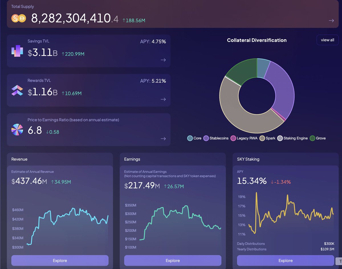 Sky Protocol revamps their analytics dashboard, boasting a Price to Earnings ratio near the memetically significant value of 6.9Stablewatch created a dashboard dedicated to Plasma
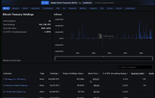 DefiLlama launches Dashboard to track Digital Asset Treasuries across Bitcoin, Ethereum, Solana and more
Sources
- https://www.youtube.com/watch?v=7j_Uhl8qHn4
- https://dune.com
- https://defillama.com/pro
- https://docs.dune.com/web-app/dashboards
- https://coinstats.app/portfolio/
- https://coinrule.com/ai-powered-trading-dashboard/
- https://es.tradingview.com/scripts/orderflow/
- https://defillama.com/subscription
- https://defillama.com/stablecoins
- https://www.bridgewtf.com
- https://safe.global
- https://blockanalitica.substack.com/p/the-sky-risk-and-analytics-dashboard
- https://www.fivetran.com/learn/analytics-dashboard
- https://www.paxos.com/blog/approvals-audit-logs-webhooks-and-more-what-s-new-in-paxos-dashboard
- https://investors.leaptx.com/news-releases/news-release-details/cypherpunk-increases-its-zcash-stake-launches-new-website-and
- https://www.youtube.com/watch?v=8r5gE8F0k4U
- https://dune.com/collection/stablecoins/overview
- https://dune.com/entropy_advisors/ethena-protocol-metrics
- https://dune.com/mrblock_buidl/Curve.fi
- https://www.youtube.com/watch?v=fdGCGXcDByk
Community notes
Spot something off or out of date? Drop a note. Editors review topic notes daily and roll accepted fixes into the explainer — contributors are recognized in the monthly $SQUID drop.
Loading notes…