
Deep explainer on UI in crypto and DeFi, covering AMM and lending front-ends, security layers, institutional vs retail needs, headless and agentic UX, and how protocols like Curve, Balancer, Aave and THORChain translate complex risk into usable interfaces.
+94 sources across the wider coverage universe
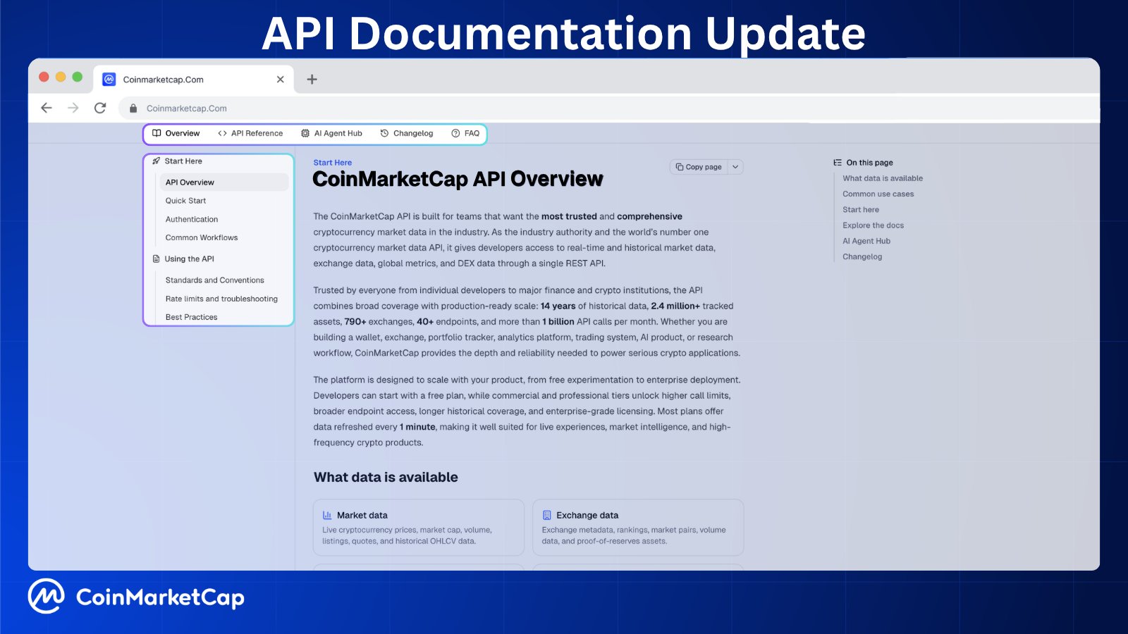 CoinMarketCap revamps Pro API documentation with cleaner UI, ready-to-copy endpoints, tutorials, and new AI Agent Hub to streamline developer workflows and integration2026-04
 Feel good using Resupply? That’s by design2025-12
 AI agent protocols like MCP, A2A, AG-UI, A2UI, AP2, and UCP aren’t competitors but layers in a growing stack, each solving a specific problem from tools and coordination to UI, payments, and commerce, enabling scalable, modular AI agents.2026-01
 InterLink unveils V5.0 upgrade with cleaner UI, multilingual News, and upcoming Visa card enabling seamless crypto spending via Apple Pay and Google Pay2026-04
 Uniswap’s UI and wallet is now charging users 0.25% on swaps2024-04
 Balancer launches its refreshed brand and new UI/UX - an extensive blazing fast AMM DeFi product suite2024-07
User Interfaces in Crypto and DeFi: An Evergreen Explainer
In crypto, user interface (UI) is the visible and interactive layer that sits between humans and blockchains, spanning everything from wallet screens and DEX dashboards to trading terminals, agent chat windows, and API consoles. As protocols like Curve, Balancer, Aave, THORChain, and LlamaLend become more complex, UI design increasingly determines not only usability and adoption, but also risk exposure, security outcomes, and even the shape of emerging agentic and AI-driven workflows.
A careful look at current trends across DeFi front-ends, institutional platforms, wallets, bridges, and AI tooling reveals a field in transition from app-centric, button-heavy screens to more modular, headless and agent-mediated interaction models. The most effective crypto UIs today combine simplicity with deep transparency, guiding users through AMM swaps, USDC-denominated balances, liquidity provisioning, and leveraged lending while exposing the underlying risk in ways that are legible to non-experts. Research on designing DeFi apps for “your parents” stresses three pillars—simplicity, transparency, and literacy—that increasingly show up in production UIs through light visual hierarchies, stepwise onboarding, and contextual tutorials. At the same time, incidents like Bithumb’s “ghost bitcoin” misallocation demonstrate how subtle UI changes can obscure deeper structural flaws in centralized systems, underscoring the limits of interface-level fixes when critical controls are missing at the ledger and governance layers. New developments, from Aave V4’s modular architecture and refreshed UI, to THORChain’s focus on front-ends after enabling smart contracts, to Coinbase Prime’s unified trading interface for institutions, illustrate how UI considerations are now threaded into protocol roadmaps rather than treated as an afterthought. Overlaying this, the rise of headless systems, AI agents, and tools like Orchids—the AI IDE that ranks highly on UI benchmarks and can generate complete full-stack apps—suggests that the future of crypto UI will be as much about machine-mediated interaction and composable APIs as about pixels on screen. This explainer traces how UI functions in crypto today, what makes DeFi interfaces distinct, how security and composability reshape design constraints, and where emerging paradigms like agentic UX and invisible interfaces may take the ecosystem next.
Introduction: Why UI Matters So Much in Crypto
User interface design has always mattered in software, but in crypto it is unusually consequential because the UI sits at the boundary between irreversible financial actions and often opaque, probabilistic systems. In a typical web application, a confusing interface might cost a user some time or lead to a misconfigured profile; in DeFi, a poorly designed confirmation dialog, a misleading slippage field, or an ambiguous warning about network risk can mean permanent loss of funds. The stakes are higher because blockchains intentionally minimize centralized recourse: once a transaction has been signed and confirmed, UI regret cannot be undone by a support ticket or credit-card chargeback.
The second reason UI is central is the gap between protocol complexity and human mental models. Automated market makers (AMMs) use mathematical formulas over liquidity pools to set prices and execute trades without traditional order books. The exact behavior of these pools, whether in stable-swap AMMs, multi-token Balancer-style vaults, or concentrated liquidity designs, is difficult to grasp intuitively. Yet everyday users need to understand, at least roughly, what will happen to their USDC when they enter a Curve pool, add liquidity to Balancer, or borrow via LlamaLend against volatile collateral. UI becomes the primary medium through which these abstractions are made legible.
Crypto UI is also distinct because it must span multiple layers of custody and control. A swap interface is not simply a front-end to one smart contract. It must integrate tightly with wallets, chain RPCs, bridge routes, and often several underlying protocols aggregated under the hood. THORChain, for instance, is a layer-one protocol whose core purpose is to enable cross-chain swaps of native assets like BTC, ETH, and XMR directly between self-custody wallets, without wrapped tokens or centralized intermediaries. The THORChain team has emphasized that several independent teams can build and maintain front-ends, highlighting a separation of protocol from UI that is structurally different from vertically integrated centralized exchanges. This decoupling means that interface design is not only a usability concern, but also a governance and ecosystem question: which UI becomes the default is often a matter of community trust as much as engineering.
Finally, UI is where the promises and risks of decentralization become real to users. Research on crypto UX points out that one of the biggest challenges is not merely visual polish, but “silent risk”—hazards that are invisible up until the moment of loss. Warnings about impermanent loss, price impact, bridge risk, and governance capture must be encoded into flows, microcopy, and visual hierarchies. If these cues are weak or absent, users may believe they understand what they are doing when in fact they are exposed to complex correlated risks. Consequently, any evergreen understanding of crypto must treat UI not as decoration but as a primary control surface for risk, education, and trust.

CoinMarketCap revamps Pro API documentation with cleaner UI, ready-to-copy endpoints, tutorials, and new AI Agent Hub to streamline developer workflows and integration

Binance-owned CMC pivoting docs for AI agents while DeFiLlama and chain-native indexers already serve the cross-DEX and on-chain data that production agents actually need. CEX-centric aggregation is a structural disadvantage when the workflow is scanning 30+ chains for arb or exploit signals. The 'ready-to-copy endpoints' polish is downstream of a data model that's still solving last cycle's problem.
Readers engage with UI not as aesthetics but as a financial control surface — the same interface layer that protocols use to extract fees unilaterally (Uniswap's 0.15% → 0.25% escalation drove the two most-clicked stories) is the same layer attackers exploit to drain wallets, revealing that whoever controls the frontend controls the money flow.
What “UI” Means in a Crypto Context
The Visible Layer of Decentralized Systems
In everyday language, UI refers to the on-screen components—buttons, fields, charts, and dialogs—that users interact with to achieve tasks. In crypto, this includes web dashboards, mobile apps, browser extensions, terminal-style trading views, as well as more emergent forms like chat-based agents or headless interaction via APIs. When users speak about the “Curve UI,” “the Balancer interface,” or the “LlamaLend front-end,” they are referring to the set of screens and flows that let them view balances, swap tokens, deposit collateral, and manage positions.
At a more technical level, these interfaces serve as transaction assemblers and interpreters. They must read on-chain state from smart contracts, indexers, and oracles; present that data in human-readable form; accept user intent; and then construct valid transactions for wallets to sign. An AMM swap page, for example, typically queries pool reserves, computes price impact, selects a route across several pools if necessary, and then prepares a call to the router contract, all wrapped in a few visible input fields for “From” and “To” tokens. The user only sees a minimal subset of the underlying parameters, even though under the hood the UI is orchestrating interactions with multiple contracts and chains.
The interface also acts as an interpreter between protocol jargon and human concepts. A user might care about “earning yield on USDC,” whereas the protocol is defined in terms of providing liquidity to a specific pool, receiving LP tokens, and accruing fees and incentives. Good UI translates between these layers by, for example, expressing returns in both LP share terms and familiar currency equivalents, or by using human-friendly pool names while keeping contract addresses accessible for verification. This translation function is one of the reasons that visually simple interfaces can embed complex logic.
UI versus UX versus Protocol
It is helpful to distinguish UI from user experience (UX) and from the underlying protocol layer. UX is broader, encompassing the overall journey: discovery, onboarding, sign-up, education, support channels, and even off-platform communication. UI is a subset of UX, focused on the visual and interactive touchpoints, but UX also includes how errors are handled, how information architecture supports learning, and how mental models are built over time. A DeFi UX article aimed at complete beginners emphasizes not only clean layouts but also the importance of progressive tutorials, goal-based onboarding, and personalized touches such as greeting users by name, using friendly illustrations, and offering both “lite” and “pro” modes. Those elements extend beyond UI into the domain of experience strategy.
The protocol layer, in contrast, is the set of contracts, consensus rules, and economic mechanisms that define what actions are possible and under what conditions. This layer exists regardless of any interface. Aave’s V4 initiative, for instance, focuses on governance minimization, modular architecture, and reducing the surface area for critical upgrades—concerns that primarily sit at the protocol and governance layers. However, the Aave team has also highlighted that the V4 UI will be showcased in live demos, illustrating that changes in protocol architecture will propagate into interface updates that expose new features or simplify workflows for end users. Similarly, THORChain’s core protocol has recently activated smart contracts on mainnet, but the team explicitly notes that it is now turning its attention to front-end and UI work so that users can fully access the new capabilities.
Recognizing these distinctions clarifies why some problems cannot be fixed at the UI layer alone. Bithumb’s misallocation of hundreds of thousands of “ghost bitcoins” was caused by a single data-entry error that passed directly into live trading balances, because the exchange’s internal ledger design allowed credits to be reflected in user accounts without the coins actually being available on-chain. No amount of UI polish around the trading screen could compensate for the structural absence of robust system-level controls that reconcile internal ledgers with real holdings. In such cases, UI may at best conceal or reveal underlying flaws; it cannot substitute for safe protocol and infrastructure design.
UI as Ecosystem Boundary Layer
In decentralized ecosystems, UI also functions as an ecosystem boundary layer, mediating not just user-protocol interactions but also protocol-protocol and agent-protocol relationships. A single trading screen might route orders through Balancer, Curve, and a Uniswap-style AMM, compose collateral from LlamaLend, and hedge exposure via a perpetuals DEX, while presenting the whole operation as a single “swap” or “rebalance” to the user. The end-user UI becomes a surface representation of a deeper composability graph that they never see directly.
Furthermore, the person interacting with a UI may not be a human at all. Increasingly, bots, AI agents, and automated strategies connect through the same UI endpoints—sometimes via embedded APIs, sometimes via simulated clicks or headless browser automation. Agentic protocol stacks like MCP, A2A, AG-UI, A2UI, AP2, and UCP are described as complementary layers that handle tools, coordination, UI, payments, and commerce for scalable modular agents. In this context, the “UI” is as much a machine interface as a human one, and designs that were originally crafted for screen-based interactions must be rethought for programmatic usage as well.
Core Principles of Effective Crypto UI
Simplicity without Erasing Necessary Detail
Crypto UIs must wrestle with a tension between simplicity and completeness. On the one hand, users should not be required to understand the intricacies of bonding curves, rebalancing schedules, or cross-chain messaging just to make a basic USDC transfer. On the other hand, oversimplification can be dangerous if it hides conditions or edge cases that materially affect outcomes. Research on designing DeFi apps for non-technical family members suggests starting from what users expect to accomplish on a given page and stripping away anything that does not directly support that intent. For example, a homepage might function primarily as a financial dashboard, showing progress against goals and offering quick access to common tasks like swapping, depositing, or withdrawing.
Visual simplicity often comes from a limited, consistent set of components and a restrained color palette. The same research describes experiments with light gray backgrounds, white cards with soft shadows, gentle gradients, and rounded corners, combined with a high-contrast call-to-action button to guide attention. These choices mirror broader design trends in web interfaces but also serve practical purposes in DeFi: cards can group related information such as pool stats, loan positions, and upcoming rewards; gradients can hint at interactive elements; rounded corners reduce visual noise in dense dashboards. The challenge is to keep layouts intuitively navigable without flattening away distinctions between risky and low-risk actions.
One strategy for balancing simplicity and depth is progressive disclosure. Basic swaps or deposits can be presented in a minimal form, while advanced settings—such as slippage tolerances, routing options, or gas fee customization—are tucked into expandable panels. Some UIs offer explicit “lite” and “pro” modes, mirroring the recommendation to create separate experiences for beginners and advanced users. This pattern allows professional market makers working with Balancer’s multi-token pools or actively managing concentrated liquidity to access full configuration knobs, while casual users simply see a straightforward interface for moving into or out of USDC and a small number of blue-chip assets.
Transparency and Communicating Risk
Transparency is the second pillar of robust crypto UI design, and in practice it means surfacing relevant information about pricing, fees, and risk in context. AMM interfaces, for example, should reveal the price impact of a trade relative to current pool reserves, show estimated slippage, and make clear whether routing will cross multiple pools, each with its own fee schedule. Lending interfaces should communicate borrow limits and liquidation thresholds in intuitive visual forms—such as bars that change color as a position approaches its danger zone—rather than burying ratios in fine print.
Risk communication is especially critical around decentralized exchanges and bridges. Discussions of Web3 UX point out that the biggest problem is often not poor visual design, but “silent risk” that lurks beneath seemingly smooth flows. Users may be exposed to smart contract upgrade risk, admin key control, oracle manipulation, or governance capture without realizing it. A front-end might show a simple “Create Position” button for an LP pool that involves complex impermanent loss dynamics, or offer a “one-click bridge” that relies on centralized custodians or lightly audited contracts. A new “Create” UI that promises one-transaction pool setup may improve convenience, but careful analysis warns that such simplicity can obscure uncharted risks for LPs in volatile markets.
Equally important is recognizing the limit of UI warnings as a primary control mechanism. Safenet, a security layer developed for Safe’s smart contract wallets, specifically frames its contribution as moving from mere UI warnings to enforced security at the transaction level. Instead of simply flashing a risk notice when a user attempts to sign a suspicious transaction, Safenet establishes short-lived on-chain markets where “Sentinels” can determine whether a transaction is safe or not, and that judgment is enforced by wallet guards on-chain. This design illustrates how UI and protocol can complement each other: the interface can still display explanations and confirmations, but critical decisions are backed by mechanisms that do not rely solely on human attentiveness to pop-up warnings.
The Bithumb incident highlights the danger of treating UI as a substitute for structural controls. There, a clerical error that typed “620,000 BTC” instead of “620,000 won” in a reward field led to roughly 620,000 bitcoins being credited across 249 customer accounts, despite the exchange not actually owning those coins. The absence of strong system-level safeguards allowed this erroneous input to enter live trading balances; users could trade or withdraw these phantom assets, with only partial recovery possible afterward. While Bithumb has since pledged compensation and introduced internal reforms, the key takeaway is that UI tweaks—such as slightly different confirmation dialogs or subtle button changes—cannot fix a ledger architecture that allows such errors to propagate unchecked.
Literacy and Educational Scaffolding
The third pillar, literacy, acknowledges that crypto requires users to acquire new conceptual vocabulary and mental models. Rather than expecting users to arrive fully formed, effective UIs build teaching directly into the experience. The DeFi design research mentioned earlier proposes breaking down tasks into levels so that beginners first learn to set up a wallet, make small transactions, and receive small rewards before being exposed to more complex products. Tooltips, inline explanations, and even short embedded videos can contextualize unfamiliar terms like “impermanent loss,” “liquidation threshold,” or “virtual price.”
Recently, projects have begun treating documentation and developer consoles themselves as UI surfaces. CoinMarketCap’s revamp of its Pro API documentation, for example, emphasizes a cleaner layout, faster navigation, ready-to-copy endpoints, and tutorials aimed at streamlining integration into applications, along with a new AI Agent Hub. These elements are not just “docs” in the traditional sense; they are interactive interfaces that guide both human developers and AI agents through using the platform correctly. In DeFi apps, similar patterns show up in dedicated “Learn” sections, walking users through how AMMs determine prices using formulas and liquidity pools, and how providing liquidity differs from simple token holding.
Lending platforms such as Euler have explicitly prioritized UI upgrades as part of a broader push to improve speed, reliability, and navigation. These changes are not purely cosmetic; they often realign information architecture to make risk metrics more salient and to guide users toward safer defaults. For a user considering borrowing against volatile collateral to mint more USDC or to leverage into LP positions, understanding how interest rates, utilization, and liquidation behave under stress conditions is essential. Embedding such literacy into the interface—rather than assuming users will seek it elsewhere—is key to sustainable adoption.
Pattern Library: DeFi UI Components and Workflows
Swap Screens and AMM Interfaces
At the heart of DeFi UI is the swap interface, where a user selects a token to sell and a token to buy, enters an amount, sees a rate, and executes the trade. Underneath this simple pattern lies the automated market maker model, where prices are determined by formulas over token reserves supplied by liquidity providers rather than by centralized order books. In an AMM, the UI must communicate not just the nominal rate, but also how much the trade will move the price given the current liquidity, what slippage tolerance the user is comfortable with, and what fees will be paid to LPs and protocol treasuries.
Different AMM designs shape UI in different ways. Balancer describes its protocol as providing an extensive suite of AMM products across Ethereum and select EVM chains, supporting pools with multiple tokens and various weighting schemes. Interfaces for such pools must help users understand pool composition, token weights, and the impact of their trades on the pool’s balance. THORChain, by contrast, is a chain-level AMM that enables native asset swaps between chains, allowing users to trade BTC for ETH or XMR directly from self-custody wallets without wrapped tokens. Its swap UIs must address cross-chain network fees, inbound and outbound confirmations, and potential delayed settlement, all while reassuring users that they retain control over private keys.
It is useful to compare some core AMM-focused interfaces conceptually. The table below outlines a few high-level distinctions.
| Protocol / Product | AMM Focus | UI Emphasis | Example Assets / Pools |
|---|---|---|---|
| Curve + LlamaLend | Stable and specialized pools; lending on top | Tight integration between swap and lending UIs; focus on low-slippage stablecoin pairs and niche assets | USDC and other stablecoin pools; collateralized lending markets |
| Balancer | Multi-token, configurable AMMs across EVM chains | Visualization of pool weights, yield-bearing tokens, and composability with vault architecture | Multi-asset pools including stablecoins, governance tokens, and yield-bearing derivatives |
| THORChain | Cross-chain swaps of native L1 assets | Cross-chain routing clarity, fee breakdowns, and wallet connection flows for multiple chains | BTC, ETH, XMR, and other L1 coins swapped without wrapping |
In all of these, USDC and other stablecoins play a UX role as familiar denominators and anchors. Displaying prices and portfolio values in USDC terms provides a cognitive reference point that approximates fiat stability, even if underlying pools involve complex derivatives or governance tokens. The UI’s decision to foreground USDC balances, show historical PnL in stable terms, or default to stable routing can materially influence user behavior and perceived volatility.
Liquidity Provision and LP Management Interfaces
Liquidity provision interfaces add another layer of complexity because users are not simply swapping tokens; they are taking on inventory risk in exchange for trading fees and incentives. In basic constant product AMMs, LPs deposit two tokens in a specified ratio and receive LP tokens representing their share of the pool. UIs must explain that returns come from a combination of fees, token price movements, and incentive emissions, while risks include impermanent loss and smart contract vulnerabilities.
Platforms like Balancer expand this further with multi-token pools and custom weightings, which can include yield-bearing tokens as constituents. The UI needs to help users understand how their deposit will be allocated, what the effective exposures are, and how rebalancing may affect future returns. Visualizations such as pie charts, stacked bars showing exposure by token, and historical fee charts are common. Newer products like Meteora’s dynamic liquidity market maker (DLMM) add features like “Portfolio Quick Actions” for claiming fees or closing positions, which rely on UI affordances to simplify complex operations into single clicks, while still giving users enough information to assess the consequences.
The new “Create UI” mentioned in ecosystem commentary promises one-transaction pool setup for liquidity providers. That acceleration of setup—allowing an LP to define parameters, supply assets, and deploy a pool in a single flow—offers a smoother experience but may also obscure configuration burdens that would benefit from slower, more deliberate decision-making. In volatile markets, a hastily created pool with poor parameters can lead to severe losses, particularly if incentives or external routing direct significant flow into the pool. Here, UI design should consider gating mechanisms, checklists, or simulations that help LPs stress-test their setups before committing capital.
Lending, Collateral, and Leverage Interfaces
Lending and borrowing UIs sit at the intersection of DeFi and traditional finance, translating concepts like loan-to-value ratios, interest accrual, and margin calls into crypto-native contexts. Aave’s interface, for instance, must allow users to supply assets as collateral, borrow against them, adjust positions, and monitor health factors, all while handling multiple markets and collateral types. Euler’s recent focus on UI upgrades, aimed at improving speed, reliability, and navigation, reflects the recognition that friction and confusion in these flows can directly impact risk-taking behavior and liquidation outcomes.
Curve’s LlamaLend product adds lending functionality tightly coupled with Curve’s pools, and recent updates have introduced a new LlamaLend UI alongside pool optimizations, a DAO treasury, a block oracle, and cross-chain messaging. This indicates an architectural move where lending and swapping are increasingly integrated: users may deposit LP tokens as collateral, borrow stablecoins like USDC, and then redeploy that capital across the Curve ecosystem. The UI must therefore track not only account balances, but also variations in oracle feeds and cross-chain state, ensuring that collateral valuations and liquidation thresholds are properly communicated.
In all of these cases, visual metaphors matter. Color-coded health bars, plain-language explanations of “how close you are to liquidation,” and scenario tools that simulate the impact of price changes can turn abstract ratios into actionable knowledge. Conversely, minimalistic displays that show only a single “health factor” number, without context or explanation, may cause users to underestimate their vulnerability to sudden market moves. When users leverage up on stablecoins like USDC to earn additional yield in AMM pools, the combination of protocol interactions becomes even more complex, and UI bears much of the responsibility for making that composition understandable.
- 01Protocol fee extraction via UI
Uniswap monetizing its own frontend with a unilateral fee increase — no smart-contract vote, no governance — alarmed readers because it exposed that protocols can tax users through the interface layer alone.
- 02Frontend compromise drain attacks↗
Five separate frontend hijacks (Spectra, Ethena, SpookySwap, Balancer, Curve domain) each drew triple-digit clicks because readers needed to know immediately whether their assets were at risk of being drained through a legitimate-looking UI.
- 03New primitive UI debuts↗
CoW AMM on Balancer, Curve Llama Lend on Arbitrum, and AVS reward claiming all drew significant clicks at the moment a usable interface appeared — readers treat a UI launch as the true activation event for a protocol, not the smart-contract deployment.
- 04DeFi UX rebrand waves↗
Balancer's full visual overhaul, Asymmetry's new UI reveal, and Frax's roadmap announcement each attracted readers because a polished interface signals credibility and competitive intent in a market where UX is increasingly a retention lever.
- 05UI bug causing fund misrouting
Ether Strategy's disclosure that a frontend bug silently misrouted 165 ETH — and that the team covered losses — drew clicks driven by a mix of alarm and relief, showing readers care deeply about interface-layer accountability when user funds are affected.
- 06AI-native interface generation↗
Orchids ranking #1 on UI Bench and the AG-UI / MCP agent stack framing attracted readers curious whether AI can replace traditional frontend engineers in DeFi, a question with direct implications for protocol development costs and attack surface.
Security, Compliance, and UI as Control Surface
From Warnings to On-Chain Enforcement
Security in crypto is often associated with audits, formal verification, and bug bounties at the smart contract level. Aave V4, for example, has emphasized strong security by design, achieving zero high-severity findings across nearly a year of combined security review, including formal verification and a large public contest. But even secure protocols rely on UI for critical interactions such as governance voting, risk parameter changes, and emergency shutdowns. Poorly designed interfaces can lead to mis-votes, misinterpretation of proposals, or accidental approvals.
The evolution of Safe’s ecosystem illustrates an emerging shift from UI-only warnings to enforced safeguards. Safenet, developed as a security layer in the Safe ecosystem, moves beyond displaying warnings about suspicious transactions to establishing a mechanism where so-called “Sentinels” can assess whether a transaction is safe, with their judgment enforced on-chain via wallet guards. This means that even if a user clicks through a UI warning or interacts programmatically, the transaction can still be blocked or delayed based on community or third-party assessment. For institutional treasuries or DAOs holding substantial funds in multisig wallets, this approach addresses the known problem that human operators often ignore or misinterpret UI-level warnings under time pressure.
Safenet’s framing also implicitly critiques the “move fast and break things” culture as applied to crypto treasuries. While superficial UI glitches—a misaligned button, a temporarily broken chart—may be tolerable in non-financial apps, they can have outsized impact when decisions involve multi-million-dollar transactions. Respecting this distinction requires front-end teams to coordinate more closely with protocol and security engineers so that any UI change touching critical flows is subject to higher scrutiny and controlled deployment.
UI Glitches versus Structural Failures
The Bithumb case serves as a powerful counterpoint on the limits of UI as a safety mechanism. In that incident, a reward program intended to credit users with 2,000 won mistakenly entered “2,000 bitcoin” into an internal system, resulting in approximately 620,000 BTC being reflected across 249 customer accounts. Although the exchange managed to recover 99.7 percent of the misallocated coins the same day, about 125 BTC remained unretrieved, and some users traded these phantom balances into other assets or transferred them externally. Critically, the exchange did not actually hold any of these “ghost bitcoins”; they existed only as erroneous ledger entries, yet the UI showed them as real balances available for trading.
This event exposes a structural flaw: the absence of system-level controls that reconcile internal credits with actual holdings before allowing balances to be displayed and traded. UI played a role in the sense that it presented these balances without any indication that they were unbacked; however, no realistic UI design could have prevented the fundamental issue of the ledger architecture allowing unverified credits. Bithumb has since promised to compensate affected users and implement stronger internal checks, but the lesson for UI designers is twofold. First, UI must not attempt to shoulder responsibility for constraints that belong at the system or protocol level. Second, when there are known limitations or intermediate states—such as pending reconciliations or provisional credits—the interface should label them explicitly to avoid conveying a false sense of certainty.
The broader ecosystem also shows subtler forms of this dynamic. Commentators have noted that Bithumb’s subsequent subtle UI tweaks risk giving a sense of improved safety while leaving underlying structural vulnerabilities insufficiently addressed. Thin progress bars and new icons can create a veneer of modernization, yet if the core accounting system still allows reconciliation gaps, the risk profile remains largely unchanged. For crypto audiences, distinguishing superficial UI modernization from deep structural reform is a critical literacy skill, particularly when evaluating centralized custodial platforms.
Regulatory and Institutional Interfaces
On the institutional side of crypto, UI must navigate not only usability and protocol complexity but also regulatory requirements and operational workflows. Coinbase Prime positions itself as a fully integrated platform for institutional crypto trading, custody, financing, and staking, and has introduced a unified trading UI that supports spot, futures, and cross-margin products. For professional desks, such an interface becomes an “operating system” for crypto exposure, consolidating multiple liquidity venues, margin engines, and custody accounts into a single environment. UI elements like advanced order types, risk dashboards, and audit trails support both trading efficiency and compliance obligations.
Institutional interfaces must accommodate role-based access control, approvals, and segregation of duties. An analyst might have read-only access to balances and reports; a trader might be able to initiate orders but not withdrawals; a compliance officer might require an oversight dashboard for AML and KYC checks. The UI must reflect these roles clearly to avoid accidental overreach or unauthorized actions. Furthermore, institutions often integrate such platforms via APIs, treating the UI as one of several access modalities. Here, usability extends to clarity of API documentation, sandbox environments, and standardized error messages—issues that bridge the gap between human and machine interfaces.
Intermediary platforms like InterLink, which has rolled out a version 5.0 upgrade with a cleaner UI and multilingual news, and is preparing to launch a Visa card for seamless crypto spending via Apple Pay and Google Pay, illustrate another facet of institutional UI: the need to tie crypto balances and transactions into existing payments ecosystems. Bridging card networks, mobile wallets, and on-chain activity requires careful interface design around funding flows, FX conversions, and settlement timings, all while satisfying regulatory controls. In such contexts, UI design is inseparable from product and compliance architecture.

Feel good using Resupply? That’s by design
TL;DR: Ionut Nechifor, Resupply’s UI/UX designer, crafted the protocol’s visual identity and the iconic hippo mascot. His philosophy blends clarity, usability, and emotional connection, turning complex DeFi mechanics into approachable, intuitive interfaces. Drawing on traditional sketching, vector graphics, and game-inspired aesthetics, he emphasizes simplicity, trust, and storytelling in design. Currently, he’s developing Forma, a modular UI kit for Web3 designers, aiming to streamline professional UI creation with optional AI-powered features.
Institutional versus Retail UI: Diverging Needs and Overlaps
Professional Trading Desks and Prime Brokerage UIs
Professional traders, asset managers, and treasuries typically demand information-dense UIs that can display multiple markets, order books, and risk metrics simultaneously. Coinbase Prime’s new trading UI, with integrated spot and futures trading and cross-margin functionality on a single platform, is an example of this design philosophy. For such users, the ability to customize layouts, dock and undock panels, and script automated strategies through APIs is often more important than aesthetic minimalism.
The forthcoming “Shells” product, described as a “crypto cockpit” for trading spot, perpetuals, prediction markets, and DeFi strategies, similarly emphasizes workspace customization and extensibility. It allows users to configure their workspaces to match specific workflows, choose between interacting via a traditional trading UI or via a trading agent, and extend capabilities through “Paths” powered by the Wayfinder SDK. This reflects a shift toward modular, plug-in-friendly environments where the UI acts as a frame around various tools and data sources. For advanced crypto users, such flexibility can provide a competitive edge by enabling bespoke arbitrage dashboards, multi-protocol monitoring, or automated risk alerts.
In institutional contexts, the human user is often paired with algorithmic agents—trading bots, risk monitors, or AI copilots—that also consume data and trigger actions. Agent protocols like MCP, A2A, and AG-UI position themselves as layers in a stack extending from tools and coordination down to UI and payments, enabling modular combinations of human and machine decision-making. The institutional UI thus becomes a shared workspace between humans and agents, with design considerations that include explainability (e.g., why an agent recommended a trade), override mechanisms, and logging for audit and compliance.
Wallets, Bridges, and Everyday Crypto Users
Retail interfaces, by contrast, must prioritize clarity, safety, and low cognitive overhead. Browser extensions and mobile wallets such as Ambire’s extension, which has rolled out major UI updates to unlock smoother Web3 interactions, aim to simplify the tasks of connecting to dapps, managing multiple accounts, and signing transactions. Enhancements often include clearer network indicators, consolidated views of NFTs and tokens, and streamlined permission dialogs. Similarly, MetaMask’s move toward multichain accounts aims to reduce the friction of juggling separate addresses across networks by offering a more unified account model in the UI.
Bridge interfaces face a specific set of design challenges. The BTTC Bridge’s UI upgrade, characterized as “sailing smoother waters,” suggests improvements to clarity around source and destination networks, token support, and estimated times for finality. Users must be helped to understand that cross-chain transfers may involve intermediate states where funds appear unaccounted for, or where different trust assumptions apply. Visualizing these stages, including pending states and confirmations, can reduce anxiety and prevent repeated or conflicting transfers.
Retail-facing UIs also increasingly incorporate on-ramp and off-ramp features, tying into payment cards and banking rails. InterLink’s planned Visa card support and integration with Apple Pay and Google Pay demonstrate how crypto balances can be surfaced in the same context as everyday spending, requiring UI decisions about how to represent exchange rates, network fees, and purchase histories. In addition, products like Processor—which has shipped updates improving UI feedback for network issues, along with security enhancements—highlight the importance of clear messaging when transactions are delayed or fail due to RPC or network congestion. Rather than generic “Something went wrong” errors, UIs should specify whether the problem arose from wallet signing, network connectivity, or on-chain rejection.
For retail users, one of the major UX pain points remains understanding when they are operating with self-custody versus custodial arrangements, and what that means for recovery in the event of loss. Projects like Safenet help by making wallet-level security more proactive, but the interface must still communicate the difference between signing a transaction that might be blocked by guards and signing one that will execute immediately. Tooltips, labels, and onboarding flows must systematically build literacy about phrases like “non-custodial,” “multisig,” “social recovery,” and “hardware wallet support.”
Emerging Paradigms: Headless, Agentic, and AI-Generated UI
Headless and Invisible Interfaces
A striking development in enterprise software that bears directly on crypto is the rise of headless platforms and invisible interfaces. VeChain has pointed to Salesforce’s shift toward a headless CRM model where agents can operate the system without a visible UI, suggesting that the broader “app era” is ending. The thesis is that instead of navigating a dozen separate apps, users will interact with a single agent that orchestrates workflows across backends, many of which will expose their functionality via APIs rather than traditional UIs. VeChain positions its own infrastructure as part of the rails enabling such agent-mediated operations.
In a crypto context, headless operation is already common in trading bots, MEV strategies, and on-chain automation. Yet most DeFi products are still designed primarily for direct human use in browsers and mobile apps. The trend toward headless systems suggests that more protocols and platforms will emphasize robust API surfaces and composable primitives, delivering UI only as one client among many. Builder-focused updates like CoinMarketCap’s API documentation revamp, featuring ready-to-copy endpoints and an AI Agent Hub, illustrate this direction; the “UI” in such contexts is as much about guiding agents as guiding humans.
Headless does not mean UI disappears entirely; rather, it becomes more situational. A treasurer might use an agent to manage day-to-day rebalancing and yield farming, interacting only occasionally via a dashboard that summarizes positions and flags anomalies. A retail user might rely on a chat agent embedded in their wallet to route swaps, bridge funds, and claim rewards, seeing explicit screens only when approvals are required. The core design challenge shifts from static screens to conversational intents, explainable automations, and fallbacks when agents encounter unexpected conditions.
Agentic Interfaces and Orchestrated UX
Agentic protocols like MCP, A2A, AG-UI, A2UI, AP2, and UCP are increasingly framed not as competitors but as layers in a stack that collectively solve issues from tools and coordination to UI, payments, and commerce. In such a model, the “UI layer” might manifest as agent personas, chat windows, or voice interfaces rather than traditional dashboards. Shells, with its promise that users can “use an agent or the trading UI” and configure workspaces to fit their workflows, hints at this duality. Human users can either drive the interface directly or delegate to agents that operate through the same underlying APIs and tools.
Designing for agents requires thinking about how to represent state and affordances in formats that are both machine-readable and human-auditable. For example, a DeFi platform might expose schemas for “swap,” “add_liquidity,” and “borrow” actions that agents can compose, while also providing visual views where humans can inspect what the agent proposes before final execution. Safeguards akin to Safenet’s sentinel markets could be adapted to agent operations, allowing external verifiers—human or machine—to approve or veto agent transactions before they hit the chain.
Agentic UX also amplifies concerns about silent risk and hidden complexity. If an AI agent routes a user through a complex path involving Curve pools, Balancer vaults, and LlamaLend loans, the UI must still provide intelligible summaries of exposure and risk. Regulatory concerns about suitability and disclosure may eventually demand that interfaces present certain minimum explanations before allowing agents to act on behalf of users, particularly in retail contexts. Designing such “explanation UIs” becomes a key part of agentic systems.
AI-Generated UI and Developer Tooling
On the creation side, AI is rapidly reshaping how UIs are built in the first place. Orchids, described as an AI-powered IDE for building full-stack apps, claims state-of-the-art performance on UI and full-stack benchmarks, ranking above tools like Devin, Lovable, Cursor, Bolt, Replit, and v0. It is capable of implementing frontends, backends, authentication, databases, and payments out of the box, without requiring third-party integrations. For crypto builders, such tools could significantly speed up the creation of bespoke dapp interfaces, dashboards, and operational consoles, which can then be iterated upon with human fine-tuning.
AI-generated UI is also appearing in documentation and integration experiences. CoinMarketCap’s AI Agent Hub is one example, where agents can be guided through API usage with contextual hints drawn from documentation. Similarly, AI copilots embedded in design tools can propose layout and flow changes that align with best practices or user research, such as adding more explicit warnings around risky actions or simplifying multi-step onboarding for DeFi products. Over time, a feedback loop may emerge where data about which UI patterns lead to fewer user errors or lower liquidation rates inform AI-generated designs.
However, AI-generated UI raises its own questions about consistency, accessibility, and accountability. If different parts of a protocol’s ecosystem—core app, governance portal, analytics dashboard—are generated or heavily edited by different AI tools, maintaining a coherent design system becomes more challenging. Aave V4’s emphasis on modularity and reduced governance overhead at the protocol level has an echo in UI design: teams may want modular, reusable components whose behavior and appearance are governed by shared design tokens and patterns, even if AI assists in composing them into specific screens.
- 2023-07exploit
Curve Finance domain redirected to wallet-draining frontend
Balancer website compromised via domain registrar social engineering
- 2023-10milestone
Uniswap Labs introduces 0.15% UI fee on select token swaps
- 2024-04milestone
Uniswap raises frontend fee to 0.25%, extends to wallet app
- 2024-06launch
DeFi Saver launches first third-party UI for Curve Llama Lend
Euler begins UI upgrade rolling out new interface
CoW AMM exits beta and goes live on Balancer UI
Orchids AI fullstack engineer ranks #1 on UI Bench, challenging traditional frontend development
Designing UI for Risky, Composable Systems
Surfacing Composability without Overwhelming Users
Composability is a defining feature of DeFi: protocols can build on each other, stacking features to create complex products such as leveraged yield farming, structured products, or cross-chain routing. From a UI perspective, composability risks overwhelming users with layers of abstraction. For instance, a user might deposit USDC into a Curve pool, receive LP tokens that are then staked for rewards, while also using those LP tokens as collateral in LlamaLend to borrow more USDC and loop positions. If the interface glosses over these steps as a single “super yield” product, the user may not appreciate the cascade of liquidation risks and smart contract dependencies involved.
A more responsible UI design approach is to show composability explicitly but progressively. High-level summaries can express “Your position is exposed to these protocols: Curve, LlamaLend, Oracle X,” with options to drill down into details. Meteora’s “Portfolio Quick Actions” for claiming fees or closing DLMM positions demonstrate a pattern where complex operations are packaged into single actions but are contextualized within a clear portfolio view that shows position sizes, fees earned, and risk status. Similarly, Euler’s UI upgrades focused on speed and navigation can support composability by making it easier for users to move between underlying markets and composite strategies.
When new UIs like the “Create” one offer one-transaction pool setup or one-click strategy deployment, they should ideally incorporate pre-flight checks and scenario analysis. Before confirming, users could be shown stress tests: what happens if the underlying asset drops 50 percent, if a key oracle fails, or if a governance decision changes incentive structures. Such simulations need not be precise predictions, but they can anchor expectations and discourage blind trust in aggregated products.
USDC as UX Anchor and Risk Vector
Stablecoins such as USDC function as UX anchors in crypto. By denominating balances, prices, and yields in units that approximate dollars, UIs create a sense of stability and familiarity for users. Protocols often use USDC as collateral, base assets in AMM pools, and settlement currency for fees and rewards. From a design perspective, showing portfolio value and PnL in USDC can simplify mental accounting and encourage more active engagement with DeFi products.
At the same time, over-reliance on a single stable asset can obscure concentration risks. If a user’s positions across Curve, Balancer, and LlamaLend all revolve around USDC pairs, they may be more exposed to stablecoin-specific risks—such as depegging or blacklisting—than they realize. UI can help by making the stablecoin’s risk profile more salient, indicating whether it is centrally issued, collateralized with specific assets, or algorithmic, and showing historical peg deviations. When users enter a USDC-based AMM pool, an interface could highlight that their effective exposure includes both the stablecoin and any other assets in the pool.
In addition, regulations around stablecoins are evolving, and UIs must be prepared to reflect changes in issuers’ policies, such as sanctions lists or KYC requirements for redemptions. A wallet or DEX interface that simply shows USDC as “just another token” may not adequately convey the off-chain legal and compliance dimensions. Integrations with on-chain reputation systems or risk oracles could enable more explicit labeling of assets by category and risk level.
Case Study: LlamaLend UI in the Curve Ecosystem
Curve’s June 2025 recap, which included pool optimizations, a DAO treasury, a new LlamaLend UI, a block oracle, and cross-chain messaging, provides a compact snapshot of how UI evolves alongside protocol capabilities. LlamaLend sits at the intersection of Curve’s core AMM pools and lending functionality, allowing users to borrow against positions and leverage exposure. Implementing a dedicated LlamaLend UI required reconciling several dimensions: presenting lending markets in the context of existing pools, integrating oracle feeds for collateral valuation, and handling cross-chain interactions where markets span multiple networks.
The new UI likely had to make trade-offs between showing all relevant parameters—interest rate curves, collateral factors, oracle sources, cross-chain bridge assumptions—and maintaining a manageable cognitive load. One approach is to reuse familiar visual patterns from the main Curve interface, such as pool cards and simplified APR displays, while adding lending-specific elements like health factors and liquidation warnings. Another is to create clear separation between simple “borrow stablecoin” flows and advanced “multi-collateral strategy” screens, so that users can gradually graduate to complexity.
The addition of a DAO treasury and block oracle also affects UI indirectly. Treasury dashboards must show inflows from protocol fees, distributions to different purposes, and governance decisions affecting treasury allocations. Block oracles used for pricing and security must be visible to users at least at a high level, so that they understand why certain assets can or cannot be used as collateral at a given time. The more transparent these dependencies are in the UI, the more empowered users are to make informed decisions about participation.
Visual Trends and Design Systems in Crypto UI
Common Patterns: Cards, Gradients, and Dashboards
Despite the complexity under the hood, many crypto UIs converge on a similar visual vocabulary: card-based layouts, soft backgrounds, clear contrast for calls to action, and responsive dashboards. The DeFi design research mentioned earlier explicitly experimented with light grey backgrounds, white tiles with shadows, soft gradients, and rounded cards, combined with dark buttons for primary actions to achieve high contrast. These elements are common because they help segment dense information into digestible chunks, allowing users to focus on one action or metric at a time.
Dashboards serve as central hubs, presenting balances, recent activity, yield summaries, and health indicators in a single view. They may include filterable tables for positions, expandable rows for details, and inline actions like “Claim,” “Rebalance,” or “Repay.” Ensuring that these dashboards perform well across devices and networks is a non-trivial engineering task; Euler’s emphasis on upgrading UI speed and reliability reflects the user frustration that arises when dashboards lag behind on-chain state or fail to update in a timely fashion.
Visual consistency is reinforced by design systems: collections of components, typography, color tokens, and interaction patterns that can be reused across pages and products. For multi-product ecosystems like Balancer, which spans AMM pools, governance, and analytics across chains, a coherent design system ensures that users learn patterns once and apply them everywhere. Aave’s work on V4’s architecture, which focuses on modularity and reducing governance overhead, has parallels on the front-end, where modular components can be updated and audited independently, reducing the blast radius of UI bugs or design missteps.
Novel Visual Trends: Floating Canvases and Liquid Glass
In addition to standard dashboards, emerging design trends are influencing how crypto interfaces look and feel. Discussions of “floating canvas” UIs describe interfaces as effectively infinite surfaces where users can scroll or drag around to explore portfolios or projects in constrained viewports. This pattern could be applied to visualize complex protocol graphs, DeFi strategies, or network maps, allowing users to zoom in and out of different positions and dependencies.
Another trend, sometimes called “liquid glass borders,” uses gradient strokes and subtle light effects to create a glassy look around interface elements. Combined with depth cues and blurs, these effects can suggest layered information or focus zones. Designers are also experimenting with “meta interfaces”—interfaces inside interfaces—and “hacky chic” styles that mimic messy desks or operating systems inside browsers. In the context of crypto, these aesthetics can resonate with power users and developers, evoking a sense of being “inside the machine,” but they risk confusing less technical users if overused.
The key is to ensure that such visual experimentation supports, rather than distracts from, core tasks and risk communication. For instance, using liquid glass borders to highlight critical security warnings or active positions might strengthen their salience. Conversely, applying complex visuals to every element may reduce clarity and increase cognitive fatigue. Design reviews should evaluate not just novelty and brand differentiation, but also the impact on comprehension and error rates, especially in high-stakes flows like withdrawals and leverage adjustments.
Design Systems and Component Libraries for Multi-Product Protocols
As protocols expand into suite-like ecosystems—Aave into multiple markets and features, Balancer into cross-chain liquidity products, Curve into lending and oracles—front-end teams must maintain scalable design systems. A well-structured component library allows new features, such as Aave V4’s upcoming UI or Curve’s LlamaLend interface, to be built using tested elements that behave consistently. This reduces the need to re-solve basic problems like form validation, table sorting, modals, and notifications with every new product.
Design systems also play a role in security. By standardizing how confirmation dialogs look, where warnings appear, and how disabled states are represented, they minimize the chance that new features inadvertently hide critical information. Safenet’s approach to on-chain enforcement can be mirrored in design systems by codifying “blocking” UI states (e.g., when an action is disallowed by guards) and ensuring that they are visually distinct from optional warnings. Similarly, protocol-specific edge cases—such as THORChain’s cross-chain delays, Balancer’s multi-token pool constraints, or LlamaLend’s collateral requirements—can be encoded as reusable UI patterns rather than ad hoc implementations.
Dribbble and similar platforms host thousands of designs for API platforms and dashboards, providing inspiration but also reinforcing best practices: clear spacing, legible typography, and responsive layouts. For crypto teams, the challenge is to adapt such generic patterns to the unique demands of on-chain state and irreversible actions. Tools like Orchids further enable rapid prototyping of designs within these systems, but maintaining governance and consistency over the resulting UI requires organizational discipline.
AI agent protocols like MCP, A2A, AG-UI, A2UI, AP2, and UCP aren’t competitors but layers in a growing stack, each solving a specific problem from tools and coordination to UI, payments, and commerce, enabling scalable, modular AI agents.
Developer Ergonomics and API-Facing UI
Documentation Portals as Critical Interfaces
While much attention focuses on end-user UIs, developer-facing interfaces—docs portals, dashboards, log consoles—are equally vital in the crypto stack. CoinMarketCap’s Pro API documentation revamp exemplifies this. The update features cleaner navigation, ready-to-copy code snippets, and tutorials designed to fit modern workflows, as well as an AI Agent Hub that supports agent-based integrations. These elements reduce integration friction and help ensure that data is used correctly, which in turn supports accurate price feeds and analytics across the ecosystem.
For DeFi protocols, similar documentation UIs often include interactive “try it out” consoles, SDK references, and schema explorers. Although these may be considered subproducts rather than primary user interfaces, they have significant downstream effects. A confusing API portal can lead to mis-integrations that manifest as wrong data in wallet UIs, price tracking sites, or risk dashboards. Conversely, a clear, well-structured documentation UI can propagate best practices and reduce the incidence of subtle bugs.
Developer UIs also matter for protocol governance and operations. Admin dashboards for monitoring on-chain metrics, upgrading contracts, and managing multisigs must be particularly carefully designed, because mistakes can have systemic consequences. As multi-sig wallets like Safe become central to DAO and treasury operations, the admin-facing UIs for creating, modifying, and executing transactions require both usability and strong guardrails. Integrations with Safenet and similar security modules must be reflected in UI states that clearly indicate when a transaction is pending sentinel review, blocked, or approved.
Full-Stack Tools and AI IDEs for Web3
Tools like Orchids expand the notion of UI further by treating the development environment itself as a high-level interface for building crypto apps. Orchids is positioned as an AI-powered IDE that can handle frontend, backend, authentication, databases, and payments without third-party integrations, and has achieved top rankings in UI and full-stack capability benchmarks in the emerging landscape of AI coding tools. For Web3 developers, such tools can auto-generate dapp UIs wired directly to smart contracts, create admin dashboards for protocol monitoring, and scaffold documentation portals that integrate with on-chain registries.
As AI IDEs become more capable, the boundary between design and implementation blurs. A product manager might describe a desired user flow in natural language—“Connect wallet, display USDC balance across Curve and Balancer positions, offer one-click rebalance into LlamaLend-backed strategies with risk summaries”—and the AI tool could produce both interface code and backend integrations. While this accelerates iteration, it also raises questions about testing, security review, and alignment with design systems. Crypto teams will likely need workflows that combine AI-generated prototypes with human design and security review loops, particularly for flows involving large amounts of capital or complex composability.
Developer tooling must also consider new runtime environments, such as agent platforms that manage multiple AI agents interacting with dapps. Interfaces for configuring agents’ permissions, scopes, and safeguards become specialized UIs in their own right. They must be intuitive enough for developers and security teams to reason about the behavior of agents that act on behalf of users in DeFi protocols, yet precise enough to map to low-level permissions enforced by wallets and guard contracts.
- Smart-contractLow
The dominant UI risks in clicked headlines are frontend-layer (DNS hijacks, fee logic, routing bugs), not smart-contract vulnerabilities — Curve's 2023 domain attack explicitly noted all contracts were safe while the UI was malicious.
- CentralizationHigh
Uniswap Labs changed its frontend fee twice without on-chain governance, demonstrating that a single team controlling a canonical UI can unilaterally alter user economics for millions of swaps.
At least five prominent protocol frontends were compromised via domain hijacking or DNS poisoning in the covered period, and every incident carried identical drain risk regardless of how secure the underlying contracts were.
- RegulatoryMedium
Fee extraction through a centralized UI operated by a legal entity (Uniswap Labs) creates a clearer regulatory target than a pure smart-contract protocol, raising the prospect that UI operators become subject to money-transmission or broker regulations.
- LiquidityLow
UI-level issues rarely affect underlying liquidity pools directly — the Spectra and Ethena compromises prompted users to stay away from the interface, not a run on pool reserves.
- Operational / bugMedium
Ether Strategy's 165 ETH misrouting from a UI bug shows that frontend routing logic — separate from audited contracts — carries real fund-loss risk that protocols may absorb voluntarily to protect reputation.
UX, Updates, and the Ship-Fast Dilemma
Continuous Improvement and UI Release Cadence
Crypto products tend to evolve rapidly, with frequent updates to both protocol and UI. Euler’s announcement of a rolling UI upgrade, focused on improving speed, reliability, and navigation over weeks rather than all at once, is emblematic of a trend toward incremental, user-centered refinement. This approach allows teams to gather feedback, monitor analytics, and fix issues before they propagate widely. THORChain’s roadmap, which shifted focus to frontend and UI after activating smart contracts on mainnet, similarly recognizes that user-facing experience must keep pace with protocol capabilities for those capabilities to be fully realized.
Other projects have announced major UI improvements or rebrands, such as LiquidBoost, which effectively rebrands Convergence’s products under a new UI/UX in anticipation of further developments, or Clanker, whose new UI aims to empower projects, teams, communities, and traders with easier tools. Wallets like Ambire have rolled out significant UI updates to streamline Web3 interactions, and bridge platforms like BTTC have shipped upgrades to make cross-chain transfers smoother. Meteora’s rapid shipping of UI upgrades, including Portfolio Quick Actions, showcases an iterative ethos where user feedback about friction points informs actionable changes.
However, high update cadence must be balanced with stability, especially for interfaces used by DAOs and institutional treasuries. The oft-quoted “Move fast and break things” mantra is tolerable for social apps but risky in financial contexts, particularly when front-end changes may coincide with protocol upgrades or governance actions. Even small UI modifications—such as reordering buttons, renaming options, or altering default settings—can influence user decisions about risk-taking, leverage, or governance voting. Teams should therefore adopt deployment strategies that include feature flags, staged rollouts, and robust testing in testnets or staging environments.
Change Management, Onboarding, and User Trust
Frequent UI changes also pose challenges for onboarding and trust. Users who have learned where to find certain controls, how to interpret certain metrics, or what particular color codes mean may struggle when those conventions shift. In DeFi, where misclicks can lead to incorrect asset selection or accidental leverage, such confusion can have material consequences. Well-designed change management includes in-UI announcements, guided tours of new layouts, and perhaps a temporary option to revert to a “classic” interface for users who need time to adapt.
The risk of subtle UI tweaks masking deeper issues is again illustrated by the Bithumb example. After a major incident, cosmetic updates can be perceived as attempts to reassure users without fundamentally changing the underlying infrastructure. To maintain trust, platforms should pair UI updates with transparent communication about structural changes—such as new reconciliation systems, on-chain proof-of-reserve mechanisms, or third-party audits—and surface those changes in the interface itself, for example via dashboards showing reserve attestations or security statuses.
At the same time, UX research suggests that feeling good while using a product is itself a signal of trust and adoption. Commentary around products like Resupply notes that positive emotional responses are often the result of deliberate design choices—smooth animations, clear feedback, and empowering flows. For crypto products, achieving this “feel-good” UX must be balanced with sober risk communication. Delight should not come at the expense of awareness; a sense of effortlessness must coexist with clear signaling of stakes and consequences.
Conclusion
User interfaces in crypto and DeFi are far more than aesthetic wrappers around protocols. They function as transaction assemblers, interpreters of on-chain state, risk dashboards, educational scaffolding, and increasingly as collaboration surfaces between humans and AI agents. As protocols like Aave, Curve, Balancer, THORChain, and LlamaLend grow more sophisticated, UI design has to reconcile competing demands: simplicity versus transparency, speed versus safety, and innovation versus consistency. Research on designing DeFi experiences for non-experts emphasizes three enduring pillars—simplicity, transparency, and literacy—that are increasingly reflected in modern DeFi front-ends through card-based layouts, progressive disclosure of advanced options, inline tutorials, and personalized onboarding.
Security considerations cut across UI and protocol layers. Experiences such as Bithumb’s “ghost bitcoin” misallocation show that UI cannot compensate for missing structural controls in ledger and reconciliation systems. Conversely, innovations like Safenet demonstrate how on-chain guardrails can complement interfaces by enforcing security decisions beyond the reach of accidental clicks and ignored warnings. Institutional platforms such as Coinbase Prime illustrate how high-density UIs can support complex trading and compliance workflows, while retail-focused wallets, bridges, and mobile apps strive to hide complexity without erasing critical risk information. The accelerating pace of UI updates—from Euler and Meteora’s performance-focused refinements to product-wide rebrands like LiquidBoost and new UIs for Clanker and BTTC Bridge—highlights both the promise and the peril of a “ship fast” culture in financial software.
Looking forward, emerging paradigms such as headless platforms, agentic UX, and AI-generated interfaces will reshape what “UI” means in crypto. VeChain’s observation that the app era is giving way to agent-mediated workflows, Salesforce’s move toward a headless CRM, and the rise of AI IDEs like Orchids all point toward a future where many interactions with DeFi protocols may be mediated by agents rather than direct clicks. In that world, UI will increasingly serve as an oversight and explanation layer, enabling humans to supervise, audit, and override agent actions rather than operating every control manually. Yet the core responsibilities of crypto UI will remain constant: to reveal rather than conceal risk, to translate complex mechanics into understandable mental models, and to give users—whether retail or institutional, human or machine—the clarity they need to make informed decisions.
Outlook
For crypto UI, the next few years will likely bring a gradual shift from isolated app-centric dashboards toward modular, agent-friendly, and headless architectures, in which GUIs, APIs, and conversational interfaces coexist as peers rather than as primary-versus-secondary channels. Protocols will continue to invest heavily in front-ends, as seen with Aave V4’s planned UI, Curve’s dedicated LlamaLend interface, and THORChain’s post-smart-contract focus on user experience. At the same time, security layers like Safenet and agent stacks like MCP and AG-UI will push more responsibility for safety into enforceable mechanisms beneath the UI.
For designers, developers, and product teams, the evergreen task will be to maintain a focus on clarity, risk literacy, and composability-aware interfaces, even as visual trends and tooling evolve. Stable assets like USDC will continue to function as UX anchors, while AMMs, lending protocols, and cross-chain bridges become increasingly integrated behind the scenes. In this environment, success will depend less on flashy redesigns and more on carefully orchestrated, trustworthy interfaces that align human and protocol incentives—and that remain legible even when the visible UI is only one of many eyes and agents interacting with the chain.
Latest UI news
CoinMarketCap revamps Pro API documentation with cleaner UI, ready-to-copy endpoints, tutorials, and new AI Agent Hub to streamline developer workflows and integrationFeel good using Resupply? That’s by designAI agent protocols like MCP, A2A, AG-UI, A2UI, AP2, and UCP aren’t competitors but layers in a growing stack, each solving a specific problem from tools and coordination to UI, payments, and commerce, enabling scalable, modular AI agents.InterLink unveils V5.0 upgrade with cleaner UI, multilingual News, and upcoming Visa card enabling seamless crypto spending via Apple Pay and Google Pay Managing multiple accounts across blockchain networks can become cumbersome or frustrating, Metamask is introducing a major UI/UX update: Multichain Accounts.
 LiquidBoost launches, which effectively serves as a rebrand of Convergence's products under a new UI/UX in anticipation for Tangent
Sources
- https://uxdesign.cc/how-to-design-a-defi-app-for-your-mom-a3ba0758154e
- https://aave.com/blog/aave-v4-security-by-design
- https://x.com/vechainofficial/status/2059345322040856970
- https://dribbble.com/search/api-platform
- https://x.com/AIWayfinder/status/2054602193089532031
- https://x.com/safe/status/2052690178347880782
- https://www.facebook.com/CoinMarketCap/posts/-coinmarketcap-pro-api-documentation-the-api-docs-have-been-rebuilt-from-the-gro/1377304534426936/
- https://www.tradingview.com/news/coindar:c0737a167094b:0-euler-begins-ui-upgrade-on-april-15th/
- https://www.facebook.com/groups/2788777944712613/posts/4451310185126039/
- https://thorchain.org
- https://balancer.fi
- https://www.longhash.vc/post/the-next-generation-of-automated-market-makers-in-a-liquid-defi-world
- https://www.coinbase.com/prime
- https://www.cyfrin.io/glossary/amm
- https://www.koreaherald.com/article/10672845
- https://x.com/safe
- https://x.com/THORChain/status/1995940847809184243
- https://www.youtube.com/watch?v=3A7XjvvKhMk
- https://x.com/ethereumfndn/status/2064384874333519982
- https://www.orchids.app
Community notes
Spot something off or out of date? Drop a note. Editors review topic notes daily and roll accepted fixes into the explainer — contributors are recognized in the monthly $SQUID drop.
Loading notes…