
A comprehensive guide to crypto charts — covering candlesticks, depth charts, technical analysis, on-chain metrics, and AI-powered charting tools — for traders navigating Bitcoin, DeFi, and digital asset markets.
+23 sources across the wider coverage universe
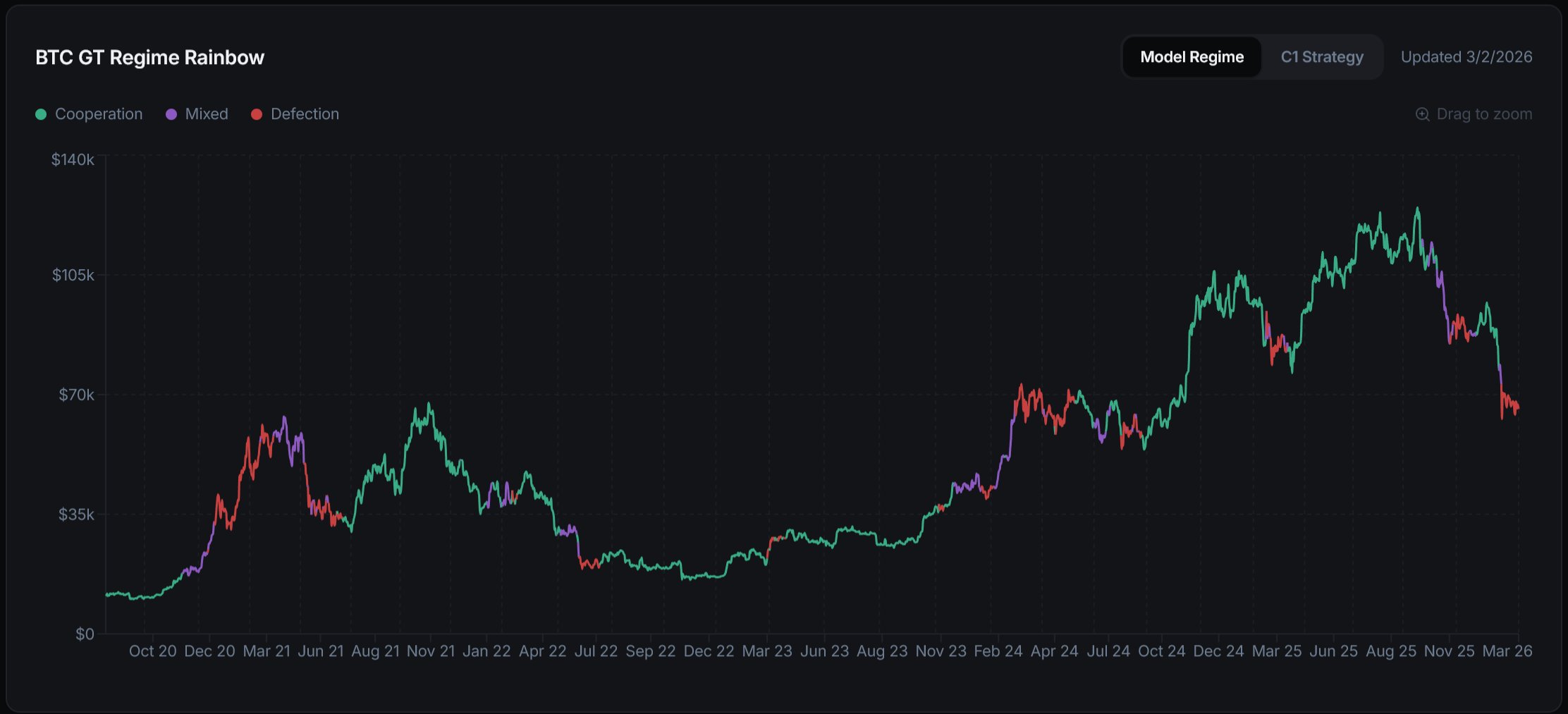 The Game Theory Rainbow Chart tracks when Bitcoin shifts from coordinated accumulation to self-interested defection regimes2026-03
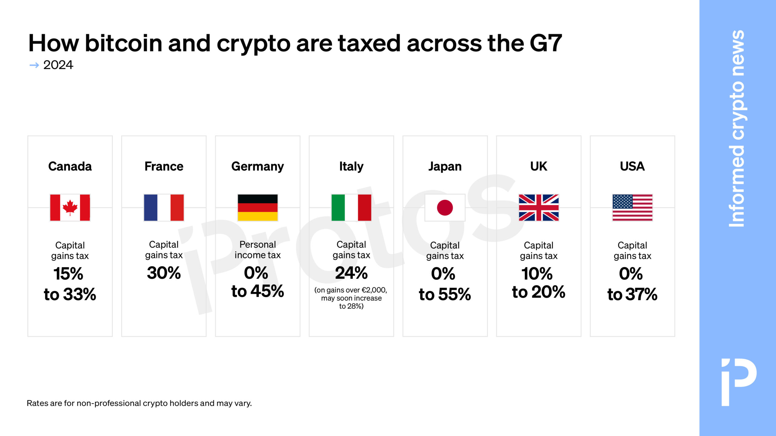 CHART: How bitcoin and crypto are taxed across the G72024-12
 A handy chart of all active Liquid Restaking Tokens, including Ether.fi, Rio, Renzo and more2024-01
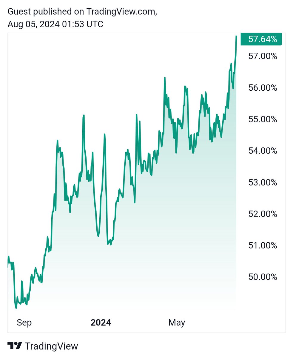 Bitcoin dominance chart today.2024-08
- Interactive chart: How Tether's $USDT beat Circle's $USDC in the stablecoin race2023-10
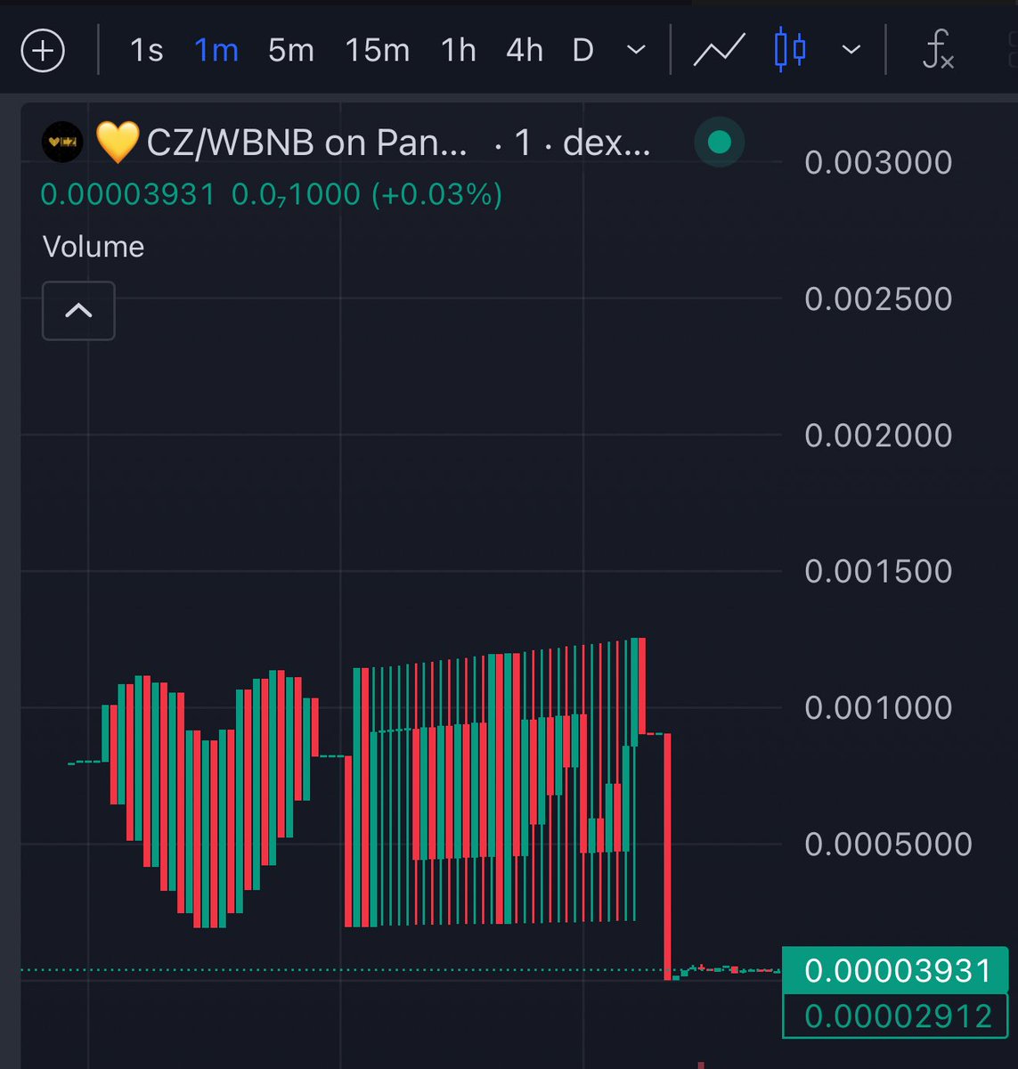 Someone launched a coin called “💛CZ” and used price action to write “❤️👍” on the chart. https://t.co/G1H4205m2a2025-08
Price and market structure charts are the foundational visual language of cryptocurrency trading — graphical representations of price action, order book depth, volume, and on-chain flows that traders, analysts, and automated systems use to read market conditions and make decisions.
Understanding how to read a crypto chart is as important as understanding the assets themselves. In a market that trades 24 hours a day, seven days a week, across hundreds of venues from Binance to Coinbase and deep into decentralized exchanges, charts compress enormous streams of real-time data into a form humans — and increasingly AI agents — can reason about. This guide breaks down the types of charts used in crypto, what they reveal, and where they fall short.
The Basics: What a Price Chart Shows
A price chart maps asset value against time. The most common format in crypto is the candlestick chart, borrowed from Japanese rice traders in the 18th century and now near-universal on platforms like Binance, TradingView, and Coinbase Advanced.
Each candlestick encodes four data points for a given time interval:
- Open — price at the start of the period
- Close — price at the end
- High — peak reached during the period
- Low — floor touched during the period
The "body" of the candle spans open to close; the "wicks" (also called shadows) extend to high and low. A green or white body means price closed higher than it opened; red or black means it closed lower. A sequence of these candles across days, hours, or one-minute intervals forms the basis for most technical analysis.
Line charts — which plot only closing prices — sacrifice granularity for clarity and are often used in longer-timeframe views or dashboards tracking portfolio performance. Bar charts, sometimes called OHLC bars, carry the same four data points as candlesticks but in a different visual form.

The Game Theory Rainbow Chart tracks when Bitcoin shifts from coordinated accumulation to self-interested defection regimes
Bitcoin’s out here playing psychological chess with itself—one minute it’s a team player stacking sats, next minute everyone’s a rugged individualist fighting for survival. Bagging profits in the presence of uncertainty is a rare skill
Readers click chart-format content not for price prediction but for comparative accountability — the highest-performing headlines use charts to rank jurisdictions, map competitive share shifts, or encode game-theoretic regime changes, treating the chart as a verdict rather than a forecast.
Depth Charts: Reading Liquidity
Beyond price history, the depth chart (or market depth chart) visualizes the live order book — all standing buy orders (bids) and sell orders (asks) aggregated by price level. The horizontal axis shows price; the vertical axis shows the cumulative volume of orders sitting at or above/below each price level.
A steep, deep curve on both sides indicates a liquid market with plenty of resting orders. A shallow, flat curve — what analysts refer to when they say a depth chart "flat lines" — signals thin liquidity. In thin markets, even a moderately sized trade can move price significantly, a phenomenon called slippage. This matters particularly for traders transacting in USDC or other stablecoins on decentralized exchanges, where pool depth determines actual execution price.
Low liquidity isn't always alarming, but it warrants attention. It can precede large price moves, indicate reduced market maker participation, or signal that an asset is losing trading interest. Depth charts on major venues like Binance and Coinbase update in real time and offer one of the clearest near-term windows into market health.
Technical Analysis: The Chart as Map
Technical analysis (TA) is the practice of using historical price and volume data — as shown on charts — to forecast future price behavior. It rests on the assumption that market psychology repeats, leaving patterns in price action that can be identified and traded.
Common TA concepts crypto traders apply to charts include:
Support and resistance — Price levels where buying (support) or selling pressure (resistance) has historically concentrated. These appear as horizontal lines or zones on a chart and often become self-fulfilling once widely followed.
Trend lines and channels — Diagonal lines connecting a series of lows (uptrend) or highs (downtrend), used to frame the prevailing direction of price.
Moving averages — Smoothed averages of price over a period (e.g., the 200-day moving average for Bitcoin is one of the most-watched indicators in crypto). The relationship between short- and long-term moving averages generates crossover signals.
Volume — Bars along the bottom of most charts indicating how much of an asset traded during each interval. Price moves accompanied by high volume are generally considered more significant than those on thin volume.
Relative Strength Index (RSI) — A momentum oscillator that measures the speed and magnitude of recent price changes, scaled 0–100. Readings above 70 traditionally suggest overbought conditions; below 30, oversold.
It's worth noting that TA has genuine critics. Academic research on efficient markets suggests that historical price patterns don't reliably predict future returns. In crypto specifically, markets are influenced by regulatory news, protocol events, and large holder behavior in ways that no chart pattern anticipates. Charts describe what has happened; they don't guarantee what will.
- 01G7 crypto tax comparison
Readers with taxable crypto positions urgently want to know how their jurisdiction stacks up against peers, and a chart collapses complex cross-border policy into a single scannable verdict.
- 02LRT ecosystem landscape map
As liquid restaking fragmented across Ether.fi, Renzo, Rio and others, a single chart answered the 'who's who' question that no single protocol's docs could.
- 03Tether vs USDC dominance race
The stablecoin market-share flip is a proxy for risk appetite and institutional trust, and an interactive chart made the magnitude of Tether's lead viscerally clear.
- 04Bitcoin behavioral cycle indicators
The Rainbow Chart and green-Sunday pattern give retail holders a behavioral framework for distinguishing coordinated accumulation from late-cycle self-interest, reducing anxiety about timing.
- 05Price-action manipulation signatures
A coin whose price action literally drew emoji on the chart made market manipulation legible and entertaining, turning a technical chart into a cultural moment.
- 06FTX accountability scorecard
Readers wanted a clear ledger of who went to prison and for how long — the chart format delivered a final reckoning on the most consequential crypto fraud.
On-Chain Charts: Data Beyond Price
One dimension where crypto markets differ fundamentally from traditional finance is the availability of on-chain data — transaction-level information recorded publicly on the blockchain. Dedicated analytics platforms translate this into charts that price action alone can't provide.
Key on-chain chart categories include:
UTXO and wallet cohort analysis — For Bitcoin, charts tracking the age and cost basis of coins held by different wallet size cohorts (sometimes called "whale charts") can reveal whether long-term holders are accumulating or distributing.
Exchange flow charts — Net flows of assets into and out of centralized exchanges like Coinbase or Binance. Sustained outflows often indicate coins moving to self-custody (broadly bullish); sustained inflows suggest preparation for selling.
Stablecoin supply charts — Growth or contraction in USDC and other stablecoin supplies is sometimes read as a leading indicator of capital ready to deploy into risk assets.
Network activity metrics — Active addresses, transaction counts, and fees paid chart the actual usage of a blockchain over time, as distinct from speculative price movement.
Platforms like Glassnode, Dune Analytics, and Nansen have made on-chain charting accessible to retail participants. The challenge is interpretation: many on-chain signals are lagging or require substantial context to read correctly.
Third green Sunday in a row — but after two brutal corrections, it might be too early to celebrate.
I just want my tokens to pump. Can it just pump?
Prediction Market Charts: A Different Kind of Signal
Beyond price, a newer category of crypto-native charting has emerged around prediction markets — platforms where participants buy and sell shares in yes/no outcomes. Andreessen Horowitz (a16z) highlighted in a recent analysis that prediction markets have expanded well beyond sports betting into tracking policy, regulatory, and macro outcomes relevant to crypto.
The "charts" here are probability curves: how the market-implied likelihood of an outcome — say, a particular SEC ruling on crypto platform regulation, or a Federal Reserve rate decision — has shifted over time. Crypto traders increasingly reference these alongside price charts, since regulatory clarity or surprise events drive outsized market moves.
- 2022-11regulatory
FTX collapse and Chapter 11 filing
- 2022-12milestone
USDC briefly surpasses Tether in market cap amid post-FTX flight to transparency
- 2023-11regulatory
SBF convicted on all seven counts; Tether re-establishes clear stablecoin dominance
- 2024-03regulatory
SBF sentenced to 25 years; co-conspirators receive aggregate 34.5 years
- 2024-04launch
EigenLayer mainnet launch enables liquid restaking token ecosystem
- 2024-06milestone
Ether.fi, Renzo, and Rio among leading LRTs tracked in aggregated landscape charts
- 2025-01milestone
Bitcoin dominance chart peaks above 60% as altcoin season stalls post-halving
AI, Charting Tools, and the Agentic Layer
The integration of AI into chart analysis is accelerating. Several distinct use cases have emerged:
AI-assisted pattern recognition — Machine learning models trained to identify chart patterns (head-and-shoulders, flags, wedges) faster and across more assets than any human analyst can track. Tools like OlaXBT's Nexus platform position this as "AI trading mastery," combining market insights with automated signal generation.
AI trading agents executing on chart signals — Agentic systems, sometimes built on platforms using API-powered trading infrastructure, can execute sub-cent trades at high frequency in response to chart-derived signals. The appeal is that these agents don't sleep, don't panic, and can act on signals faster than human reaction allows. The risk is that they can also amplify errors at speed.
Natural language interfaces — AI chatbots and copilots that allow traders to ask plain-language questions about chart conditions ("Is Bitcoin showing oversold RSI on the weekly?") and receive generated analysis. The reliability of these outputs varies significantly and warrants caution.
It's important to distinguish between AI that surfaces information from charts and AI that makes trading decisions. The former is a research tool; the latter introduces execution risk and requires robust safeguards, particularly in volatile crypto markets.
Charting Across Venues: Centralized vs. Decentralized
Charts behave differently depending on the venue being charted.
Centralized exchanges (Coinbase, Binance) aggregate their own order books, producing clean, high-liquidity depth charts and reliable price histories. Their charts are the most liquid reference price for most major assets.
Decentralized exchanges present a more fragmented picture. Price on a DEX is determined by an automated market maker (AMM) formula rather than a traditional order book, so the "depth chart" is a function of liquidity pool composition rather than resting limit orders. Aggregators like KyberSwap route orders across multiple pools, and developers building on their APIs can surface unified charts that span this fragmentation. Still, DEX charts can show significant divergence from CEX prices during high volatility — a gap traders call arbitrage opportunity or, when it persists, a warning sign.
Cross-chain considerations also complicate charting. An asset bridged from Ethereum to another chain may have its own price chart per deployment, occasionally diverging from the canonical price on higher-liquidity venues.

Someone launched a coin called “💛CZ” and used price action to write “❤️👍” on the chart. https://t.co/G1H4205m2a

I totally missed it at first too - but zoom out and it reads, "I ❤️ CZ" https://x.com/kkashi_yt/status/1954888219226706103
- RegulatoryHigh
G7 nations have materially divergent crypto tax treatments, creating compliance traps for holders with cross-border activity or unrealized gains in jurisdictions that tax in-kind swaps.
- MarketHigh
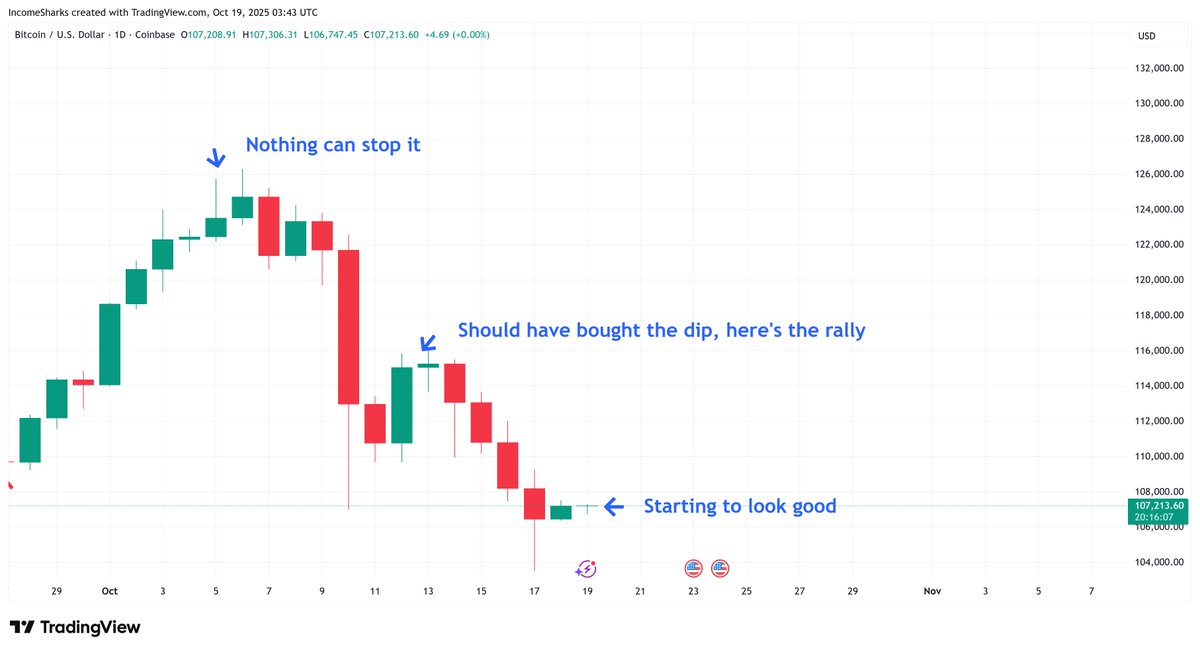
Bitcoin dominance charts show cyclical rotation into altcoins that historically precede sharp drawdowns; green-week streaks following corrections do not reliably signal trend reversal.
- CentralizationMedium
Tether's structural dominance over USDC concentrates systemic stablecoin risk in a single offshore issuer with historically opaque reserve composition.
- LiquidityMedium
LRT protocols stack restaking liquidity across multiple layers — Ether.fi, Renzo, Rio — creating cascading redemption risk if a single large restaker unwinds during a slashing event.
- ManipulationMedium
Low-cap token markets remain trivially manipulable via coordinated buy pressure, as demonstrated by the CZ-named coin whose price action was deliberately choreographed into emoji shapes.
- Smart Contract / SlashingMedium
LRT protocols inherit EigenLayer operator slashing risk; a correlated operator fault could simultaneously impair multiple restaking tokens shown in the LRT landscape chart.
Common Chart-Reading Mistakes
Even experienced traders make systematic errors with charts:
Confirmation bias — Selecting the timeframe or indicator that confirms a pre-existing view while ignoring contradicting signals on other timeframes.
Overfitting to patterns — Finding "patterns" in random noise. In a market as volatile as crypto, apparent patterns frequently fail to repeat.
Ignoring macro context — No chart exists in isolation. A textbook bullish pattern forming in Bitcoin during a macro risk-off environment driven by broader credit stress may resolve differently than the same pattern in a risk-on environment.
Neglecting volume — Price moves on thin volume are structurally weaker. A chart that shows a breakout without a corresponding volume surge deserves skepticism.
Single-venue blindness — Relying on one exchange's chart without cross-referencing the broader market, particularly for lower-cap assets where a single large player can distort readings.
Reading Charts Responsibly
Charts are tools for organizing information, not oracles. The useful mental model is probabilistic: a well-read chart doesn't tell you what will happen, it tells you what conditions are present and what scenarios are more or less consistent with historical behavior. That shifts the frame from prediction to risk management — sizing positions appropriately given uncertainty, setting stops where the thesis is clearly invalidated, and not treating a pattern as a guarantee.
For participants entering crypto markets for the first time — whether through a Coinbase One account, a DeFi yield strategy, or an AI-powered trading agent — time spent learning to read charts critically is rarely wasted. The skill compounds: charts in crypto encode real information about liquidity, market structure, and participant behavior. The trick is separating that signal from the noise.
Outlook
Chart tooling in crypto is evolving rapidly alongside the assets themselves. AI-native analysis platforms are compressing the skill gap between professional and retail traders, while on-chain data charting continues to mature into a discipline in its own right. Regulatory developments — particularly around how bodies like the SEC treat crypto trading platforms — will shape which charting venues and instruments remain accessible in major markets. Depth chart liquidity conditions will remain a useful early-warning metric as markets continue adjusting to structural changes in both centralized and decentralized trading infrastructure. The fundamentals of what a chart shows, however, are stable: price, volume, and the standing willingness of participants to buy or sell. Those signals have been worth reading for as long as markets have existed.
Latest Chart news
The Game Theory Rainbow Chart tracks when Bitcoin shifts from coordinated accumulation to self-interested defection regimesThird green Sunday in a row — but after two brutal corrections, it might be too early to celebrate.Someone launched a coin called “💛CZ” and used price action to write “❤️👍” on the chart. https://t.co/G1H4205m2aCHART: How bitcoin and crypto are taxed across the G7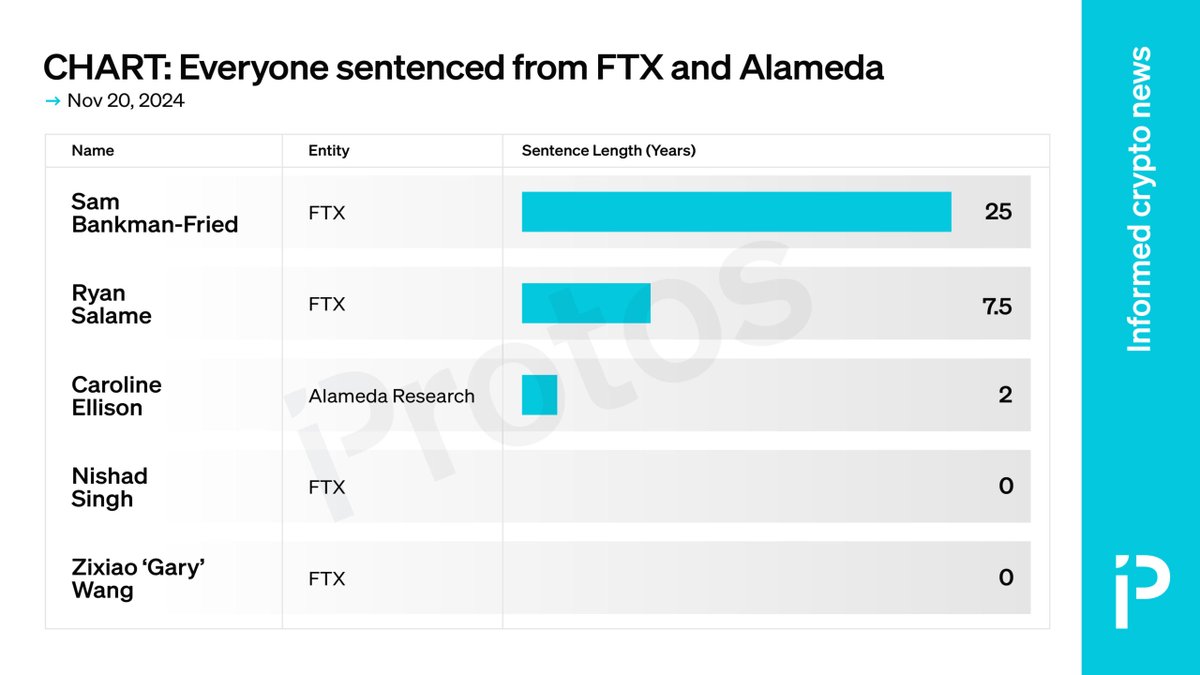 CHART: FTX and Alameda execs get a total of 34.5 years in prisonOnly 3 of the 5 execs involved in the multi-billion dollar FTX fraud scheme will serve any time in prison.Bitcoin dominance chart today.
Community notes
Spot something off or out of date? Drop a note. Editors review topic notes daily and roll accepted fixes into the explainer — contributors are recognized in the monthly $SQUID drop.
Loading notes…